Preview image. Unlock full-res
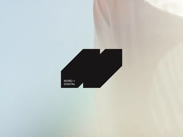
Stark black parallelogram mark on soft neutral ground, with type dropped to bottom-right corner.
Summary
A single bold black parallelogram stands alone on a gradient background of soft neutrals (pale blue, light beige, white), with "NORD + DIGITAL" in tiny white sans-serif at bottom-right.
Visual description
Composition is dominated by emptiness: a soft gradient background shifting from pale blue-grey at top to warm beige at bottom-center. A solid black quadrilateral tilted at roughly 25 degrees sits slightly left of center, its sharp angles contrasting the soft ground. The shape is unadorned and reads as both an abstract arrow and a geometric mark. Small white sans-serif text "NORD + DIGITAL" sits at bottom-right corner, understated and nearly secondary to the mark itself.
Key takeaway
The parallelogram is a flexible primary mark that suggests forward motion, technology, or agency without being literal. Dropping the wordmark to the corner emphasizes the icon and frees it for standalone lockup use. The softness of the background (not pure white, not pure color) keeps the black from feeling too harsh.
Reuse notes
Works best for tech-forward, digital, or creative agencies where a strong geometric direction feels appropriate. The minimalist approach demands confident brand strategy and sufficient whitespace in the application. Pair this with sans-serif, ample margins, and structured layouts.