Preview image. Unlock full-res
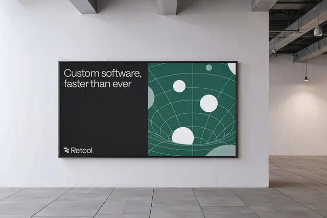
Retool's branded display merges dark typography with geometric grid patterns, balancing messaging hierarchy across a split composition.
Summary
Retool's branded presentation leverages a split-screen format with a dark typography panel on the left and an animated geometric grid pattern on the right, creating visual rhythm through geometric circles and curved grid lines.
Visual description
A landscape orientation wall display mounted in a minimal industrial space. The left half is dark charcoal with white sans-serif headline "Custom software, faster than ever" and a small white Retool wordmark logo at the bottom left corner. The right half features a teal background layered with curved grid lines (evoking an isometric or spherical topology) and white circles of varying sizes positioned at intersections, creating a sense of depth and data distribution. Natural wood flooring and hanging pendant lights ground the setting.
Key takeaway
The split-text-and-geometry approach creates immediate visual contrast and role clarity. The geometric circles on a grid scaffold reinforce a technical, data-driven positioning without explicit charts. The muted teal is sophisticated enough for B2B software without appearing trendy.
Reuse notes
Strong for SaaS, developer tool, or analytics brands. The geometric grid-and-dots motif works well as a background pattern in decks or web hero sections. Best paired with clear, restrained typography on the messaging side to avoid visual competition.