Preview image. Unlock full-res
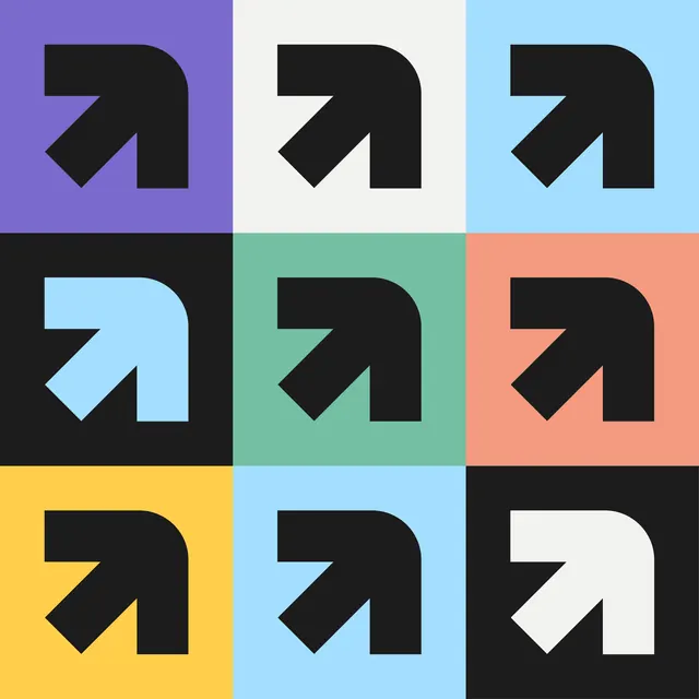
A 3x3 grid of identical forward-arrow icons in black, each placed against a different colored square background, demonstrating icon versatility and systematic color application.
Summary
A 3x3 grid of identical forward-arrow icons in black, each placed against a different colored square background, demonstrating icon versatility and systematic color application.
Visual description
Nine equal-sized squares arranged in a 3x3 grid. Each square contains an identical black arrow icon pointing diagonally upward and to the right. The background colors vary systematically: top row is deep purple, light gray/off-white, and pale cyan; middle row is black, teal/mint green, and coral/salmon pink; bottom row is bright yellow, light cyan, and charcoal/near-black. The arrow itself is rendered in bold geometric strokes, with crisp right angles where the arrow shaft meets the triangular head, emphasizing the minimal, technical aesthetic.
Key takeaway
The icon remains visually consistent and legible across nine diverse background colors, proving the mark's robustness. The grid format itself serves as a palette and icon-behavior guideline, useful for design-system documentation. The high-contrast approach ensures the mark reads clearly even against backgrounds of similar lightness (dark icon on dark background, light icon on light, etc.).
Reuse notes
Essential reference for icon designers building systems that must work in multiple color contexts. Useful for documenting accessible contrast ratios and color-pairing rules. The format works as a quick visual audit tool when adding new colors to a brand palette. Apply when designing component libraries, button-state variations, or theme-switching systems where a single icon must function across light and dark modes.
More like this







Keep what you find
A free account saves references to boards and can send you a weekly email of picks based on what you save.
To see every result, go Pro.