Preview image. Unlock full-res
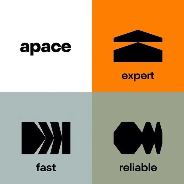
Icon and concept system for Apace, organized as a 2x2 grid with four abstract geometric icons and corresponding labels (expert, fast, reliable) paired against a warm orange, cool blue, and muted green palette.
Summary
Icon and concept system for Apace, organized as a 2x2 grid with four abstract geometric icons and corresponding labels (expert, fast, reliable) paired against a warm orange, cool blue, and muted green palette.
Visual description
A 2x2 grid divides the space into four equal quadrants, each pairing a bold black geometric icon with a single-word label below. Top-left: "apace" in black sans-serif on white background; top-right: two stacked horizontal trapezoids (suggesting stacked capacity or layering) labeled "expert" on vivid orange; bottom-left: three diagonal parallel chevrons pointing right (suggesting motion or acceleration) labeled "fast" on muted slate blue; bottom-right: an abstract interlocking or segmented shape labeled "reliable" on muted sage green. All icons use solid black fill and occupy roughly the same visual weight, creating a sense of balanced, modular system. The color palette creates clear contrast between the white, orange, and two muted grounds.
Key takeaway
The quadrant-grid structure provides a simple, scalable template for presenting multiple concepts. Each icon reduces a quality (expertise, speed, reliability) to a minimal geometric form, making the system memorable and adaptable. The color blocking (one hot accent on three calm grounds) draws attention hierarchically without overwhelming the composition.
Reuse notes
Strong for consulting, SaaS, or tech brand systems where you need to communicate core values or service pillars side-by-side. The simplicity of the icons makes them work at small scales (favicons, social) and large scales (signage). Each quadrant can be used independently or recomposed into different grid layouts.
More like this








Keep what you find
A free account saves references to boards and can send you a weekly email of picks based on what you save.
To see every result, go Pro.