Preview image. Unlock full-res
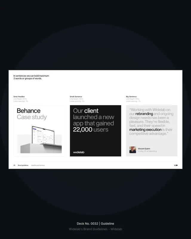
A structured guidelines page showing three text-styling examples: case study mockup, bold testimonial quote, and testimonial card, unified by clean sans-serif, white space, and monochrome palette.
Summary
A brand guidelines page demonstrating headline and sentence typographic options across three scenarios: a product case study, a testimonial claim, and a longer quoted endorsement, all rendered in a grid layout with precise line-height and letter-spacing documentation.
Visual description
The page is laid out in three equal columns separated by white space. The left column displays "Behance Case study" with a device mockup positioned below. The middle column sets a dark card containing white text, reading "Our client launched a new app that gained 22,000 users" with the Widelab logo below. The right column presents a light-gray card with a quoted testimonial, a small portrait photo of Vincent Gujahn, and his title. Above each column sits a label (Small-Headline, Small-Sentence, Big-Sentence) with technical specifications for line height and letter spacing. The overall page is printed on white with a dark background outside the content area, reinforcing the systematic, serious tone.
Key takeaway
The three-column layout for showing typographic options in context, not in isolation. The pairing of technical specs (line-height, letter-spacing) beside rendered examples. The technique of using photograph, quote, and product mock-up as different content anchors to stress-test the type hierarchy.
Reuse notes
Strong template for a brand guidelines typography page, especially B2B or corporate contexts. The layout works for 3-5 headline sizes or text roles. Maintain generous margins and alignment to grid; this approach loses authority if spacing becomes loose. The dark background outside the page card gives the impression of a printed document being presented, which works well for luxury or design-forward brands.
More like this





Keep what you find
A free account saves references to boards and can send you a weekly email of picks based on what you save.
To see every result, go Pro.