Preview image. Unlock full-res
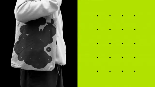
Black-ground figure with flowing, organic form paired with lime-green field and white dot grid, achieving high-impact contrast through scale and hue.
Summary
A bilingual design system: monochrome organic form on black contrasts sharply against a neon-lime field with an evenly spaced white dot grid, creating immediate visual tension and brand identity.
Visual description
The composition divides into two halves, each with distinct visual weight. The left side is pure black containing an organic, textured abstract form in gray and dark tones, suggesting a figure or textile. The right side is a pure bright lime-green field divided into an orderly grid of small white circles, creating a crisp, technical counterpoint. The color contrast is absolute: the eye cannot rest, drawn repeatedly from the soft, dark left to the bright, patterned right.
Key takeaway
The power of a single accent hue used at full saturation against neutral grounds. The juxtaposition of organic chaos with geometric order within one composition. Using patterned fill (the dot grid) to add depth to what could be a flat color field.
Reuse notes
Excellent reference for brand marks that need to express both human/organic and systematic/technical values. Works in print, packaging, and digital. The color combination reads contemporary and has high legibility from distance; lime green will dominate at small scales, so reserve the split approach for larger applications.
More like this




Keep what you find
A free account saves references to boards and can send you a weekly email of picks based on what you save.
To see every result, go Pro.