Preview image. Unlock full-res
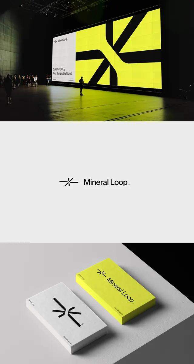
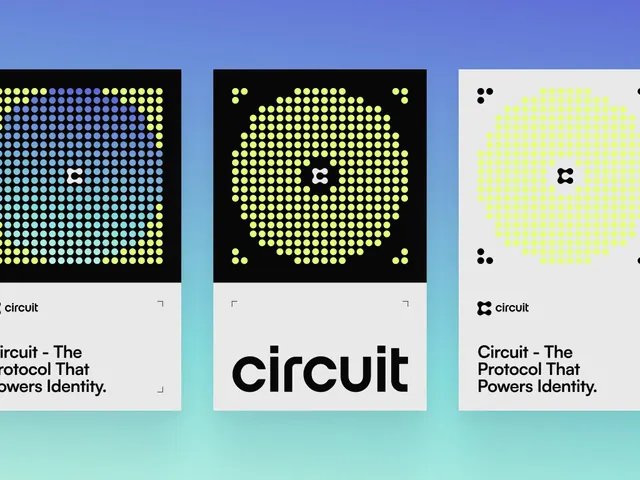
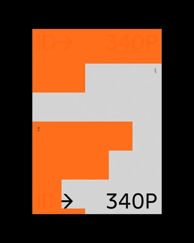
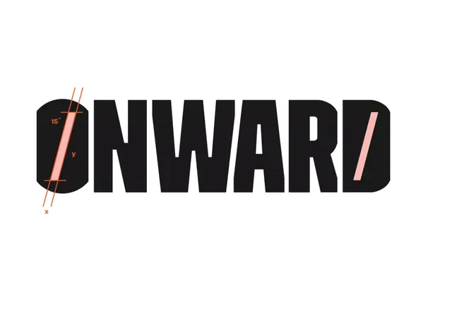
A composed mark for Formica using sharp black rectangles and circles that frame a bright yellow light-beam pointing at an eight-pointed starburst.
Summary
A composed mark for Formica uniting three black geometric shapes (rectangle, circle, and chevron-like form) that frame a bright yellow light beam pointing at an eight-pointed starburst, suggesting illumination and innovation.
Visual description
Three black geometric forms anchor the composition: a rectangle on the left, a circle overlapping in the center, and a chevron-like shape to the right. A luminous yellow triangular beam cuts horizontally across all three, emanating from the left and terminating in an eight-pointed starburst in the upper right. Beneath the mark, the brand name "FORMICA" sits in bold, widely-tracked black capitals. The entire design is rendered in pure black and bright lime-yellow (almost neon) against white negative space, creating stark, high-contrast visual impact.
Key takeaway
The elegance of reducing a mark to three simple black shapes plus one accent color; the way the yellow beam connects the otherwise discrete geometric elements into a unified composition; the precision of the starburst (eight evenly spaced points) as a light-source motif that avoids cliches like gradients or halos. The generous tracking of the wordmark creates confidence without needing a separate lockup.
Reuse notes
Excellent template for technology, energy, or innovation brands. The black-and-single-accent approach scales down crisply to favicon sizes and works equally well on full-bleed applications. The starburst reads as illumination more effectively than radiating lines; useful when "breakthrough" or "discovery" is part of the brand story. The mark works well in both positive and reversed (yellow mark on black ground).