Preview image. Unlock full-res
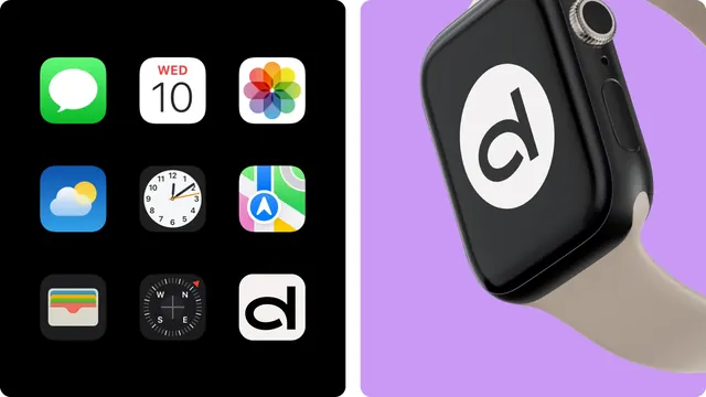
Split frame pairing the Dealio app icon sitting in a dark phone home-screen grid with a 3D-rendered smartwatch carrying the same d monogram on lilac.
More like this
See all
Summary
Two digital touchpoints side by side, both testing the same lowercase d monogram: as one tile among stock system app icons, and blown up on a watch face.
Visual description
The frame is cut roughly in half with a white gutter. The left half is a black panel holding a three-by-three grid of rounded-square app icons at generous spacing. Eight are recognizable stock system apps, the ninth and last, bottom right, is the brand icon: an off-white tile with a solid black lowercase d whose bowl is a full circle and whose stem runs straight to the baseline. The right half is a lilac field with a photorealistic 3D render of a black smartwatch, shown at a three-quarter angle from above with the crown and side button toward the top right and a sand-colored strap curving out of the bottom of the frame. The watch face is black and carries the same d monogram reversed out of a large white circle, filling most of the display. Soft studio highlights run along the case edge and crown; the strap catches a warmer light. No type in either half.
Key takeaway
Placing the icon inside a real home screen next to Apple's own icons is a blunt but honest legibility test, and the mark passes because it is one shape plus one stem. The right half then proves the same glyph inverts cleanly into a circle at any size.
Reuse notes
A strong template for the "does the mark survive the home screen" slide in an identity case study; the neighbor icons supply the scale and contrast reference for free. Pair with a wordmark frame, since this pairing only proves the monogram. The lilac backdrop is doing a lot of the separation work, so a neutral background would flatten the split.