Preview image. Unlock full-res
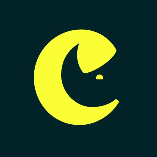
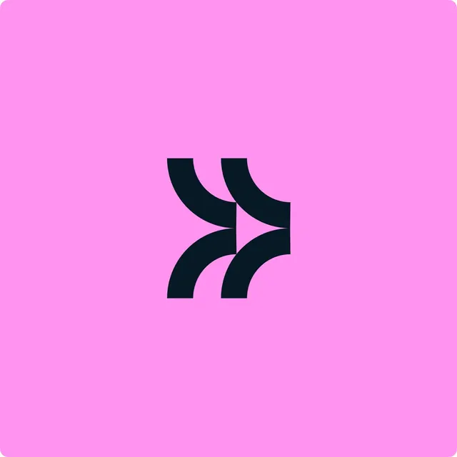
The standalone brand symbol, two navy quarter-turn strokes on hot pink whose gap between them reads as a forward arrow.
More like this
See all


Summary
The brand symbol shown on its own, color-reversed to dark navy on a hot pink square, with the arrow living entirely in the space between two thick strokes.
Visual description
A square canvas with softly rounded corners in a saturated pink. Dead center sits the mark at roughly a third of the canvas width: two identical strokes, each a thick quarter arc that starts vertical at the top and sweeps into a horizontal at the bottom, drawn in very dark navy. The second stroke is offset right and down from the first so their inner edges converge into a wedge of pink that reads as a right-pointing arrowhead, and the whole form suggests two stacked chevrons in motion. Stroke terminals are cut square, the arc radius is constant, and there is no type, container or shadow anywhere in the frame.
Key takeaway
One repeated stroke, offset and mirrored, produces both a rhythmic pattern unit and a directional arrow without drawing the arrow at all. Reversing the same mark to dark-on-bright proves the form survives a full color flip.
Reuse notes
Good for an app icon, favicon or avatar reference, and for showing a symbol's reversed colorway next to its primary lockup. The mark reads at small sizes because it is built from two shapes only; adding an outline or a container would close up the negative-space arrow that carries the idea.