Preview image. Unlock full-res
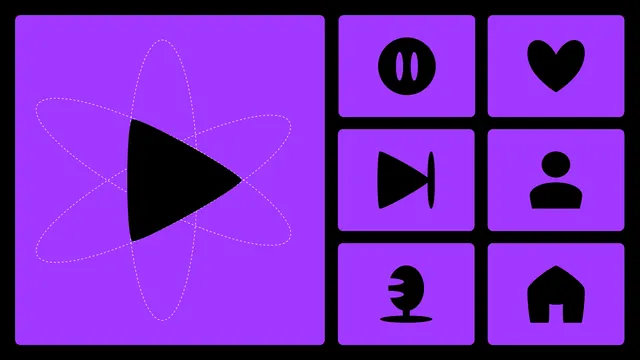
Purple and black icon system for a music streaming brand, with the play mark shown large over dashed orbital construction lines beside six rounded app icons.
More like this
See all

Summary
An icon board that puts the hero play symbol on the left at large scale with its construction geometry still visible, and a two-by-three grid of derived interface icons on the right.
Visual description
Everything sits on black. The left half is a large rounded purple square holding a black play triangle whose edges bow inward, its three points landing exactly on two crossing dashed white ellipses that read as orbital paths. The right half is a two-column, three-row grid of smaller rounded purple squares, each with one black icon: a filled circle with two vertical slits, a heart with a soft asymmetric dip, a skip-forward triangle meeting a curved bar, a shoulders-and-head avatar, a microphone on a wide oval base, and a house with a squared arch. All icons share the same heavy weight, softened corners and slightly organic curves; there is no type anywhere in the frame.
Key takeaway
Leaving the dashed construction geometry visible turns a plain symbol slide into an explanation of how the mark is drawn. Repeating the exact corner radius and stroke weight across a small utility set is what makes six unrelated glyphs read as one family.
Reuse notes
Good reference for presenting an icon system alongside its parent mark, or for a brand guideline page on symbol construction. The single-color-on-single-color approach depends on a strong duotone; it would need rework for a light interface or for icons that must sit on photography.