Preview image. Unlock full-res
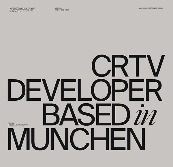
Geometric sans-serif type specimen stacking bold sans-serif with a single italic word, set on light gray with minimal typography details.
Summary
A corporate type specimen using bold geometric sans-serif in stacked lines, punctuated by a single italic word, demonstrating hierarchy and restraint on a neutral light-gray field.
Visual description
Light-gray background with three lines of large, solid sans-serif capitals: the first and third in upright weight, the second ending with a single italic word ("in"), creating a subtle typographic rhythm. The letterforms are clean and geometric with consistent stroke weight. Minimal text details float at the top (small copyright and date references) and bottom left (contact URL), leaving generous white space in the center to emphasize the type itself.
Key takeaway
The use of a single italic word among upright capitals to signal inflection without breaking the geometric grid. The restraint of stacking text vertically while maintaining strict alignment. The neutral background as an active partner, not just void.
Reuse notes
Strong for design-studio or corporate identity materials. Works best with plenty of breathing room and a confident sans-serif that reads at large scale. The mixed case/italic detail works particularly well for location or relational information.
More like this







Keep what you find
A free account saves references to boards and can send you a weekly email of picks based on what you save.
To see every result, go Pro.