Preview image. Unlock full-res
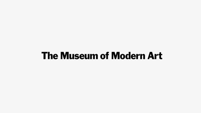
Museum institutional identity rendering with 'The Museum of Modern Art' in bold condensed sans-serif, centered on light neutral ground with abundant negative space.
Summary
Institutional wordmark rendering the full name "The Museum of Modern Art" in bold condensed sans-serif, positioned slightly above center on a light gray background.
Visual description
Black condensed sans-serif type spells out "The Museum of Modern Art" in a single bold line, rendered flush-left at approximately one-third height on a light neutral background. The typeface appears to be a classic grotesque sans-serif, likely geometric or Swiss in character. Abundant negative space surrounds the text on all sides, with the composition emphasizing restraint and legibility over visual complexity. No decorative elements, no secondary type, no imagery.
Key takeaway
The power of typographic clarity through extreme simplicity. The negative space becomes as important as the type itself, creating visual breathing room. Bold condensed sans-serif conveys institutional authority without appearing aggressive. The composition works equally well as a sign, a letterhead, or a digital footer.
Reuse notes
Essential reference for cultural and nonprofit institutions where sophistication requires understatement. The layout translates seamlessly to physical contexts (signage, business cards, websites). Works well at any scale because the geometric logic of the letterforms remains intact. Pairs naturally with minimal supporting type and photography-led layouts.
More like this






Keep what you find
A free account saves references to boards and can send you a weekly email of picks based on what you save.
To see every result, go Pro.