Preview image. Unlock full-res
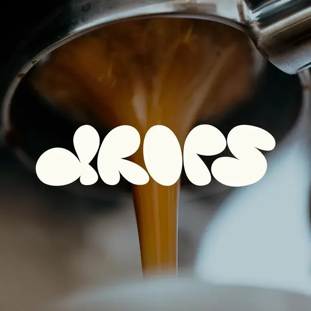
Bold, organic wordmark with rounded, flowing letterforms in white, conveying liquid elegance and smooth movement.
Colorlight, earthy, monochrome, high-contrast, warm
Typesans-serif
Moodprofessional, friendly, calm, fun
Industryfood
Tagsliquid, organic, rounded, contemporary, responsive design, clever negative space, One word, Circle, Letterform, Negative space, Rounded, Bold, Sans-Serif, wordmark, wordmark: DROPS, complementary, warm, orange, yellow, teal
Palette
#5F5A53
#B4C8CD
#552D0A
#FCFBF2
#020302

Summary
Bold, organic wordmark with rounded, flowing letterforms in white, conveying liquid elegance and smooth movement.
Visual description
The logo consists of the word "drops" in a thick, rounded, bubble-style typeface. The letters are solid white and overlap slightly. The text is centered over a photograph of brown liquid pouring from a metal spout.
Key takeaway
Use an ultra-bold, rounded typeface with overlapping characters to create a cohesive, fluid shape.
Reuse notes
Reach for this when designing a wordmark for food & drink, e-commerce & dtc. Pairs with modern, friendly identity systems. Original by Gordesigns.