Preview image. Unlock full-res
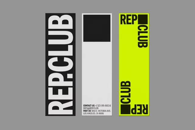
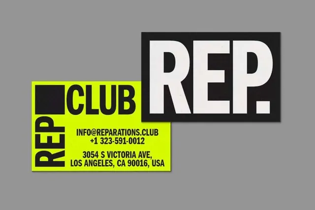
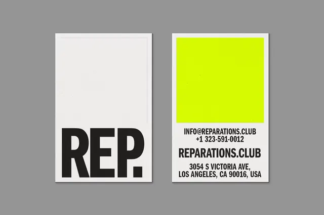
Two minimalist printed cards are shown side by side on a gray background, one with a large cropped \"REP.\" wordmark and one with a neon yellow block above contact information.
Summary
Two minimalist printed cards are shown side by side on a gray background, one with a large cropped "REP." wordmark and one with a neon yellow block above contact information.
Visual description
A gray presentation background holds two tall white card-like layouts with subtle shadows. The left card is mostly blank with a huge black cropped "REP." wordmark anchored at the bottom, while the right card has a bright neon yellow square near the top and stacked black contact text below it.
Key takeaway
Use extreme typographic scale contrast to make a simple identity feel memorable. Pair lots of empty space with one loud color block to create a sharp, modern print system.
Reuse notes
Reach for this when you need a minimal brand presentation that still has strong shelf impact. It works best for identity systems, business cards, or printed leave-behinds where a single bold type moment can carry the page.