Preview image. Unlock full-res
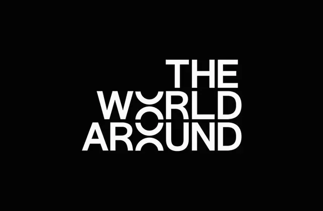
High-contrast wordmark stacking three lines of sans-serif type with a circular aperture cut from the middle word, on solid black background.
Summary
High-contrast wordmark stacking three lines of sans-serif type with a circular aperture cut from the middle word, on solid black background.
Visual description
White sans-serif text arranged in three stacked lines centered on black background: "THE" (top), "WORLD" (middle), and "AROUND" (bottom). The middle word features a large negative circular aperture cutting through the letter O, creating a void that reveals the black background within the wordmark itself. All letters are uppercase and set in a geometric sans-serif with consistent weight and tight tracking. The aperture is the sole decorative element, introducing visual complexity and movement while maintaining stark minimalism.
Key takeaway
The cutout creates focal interest and dynamism within a purely typographic lockup. Instead of adding marks or embellishments, subtracting (the void through the O) generates sophistication and a memorable detail. This approach is editorial and daring, distinguishing the identity while remaining minimal.
Reuse notes
Excellent for media, publishing, or cultural brands where typography is the primary visual device. The dramatic black/white contrast demands strong presentation space and reads powerfully at large display sizes. The cutout detail is a signature move, so it works best for a distinct brand that can own this gesture.