Preview image. Unlock full-res
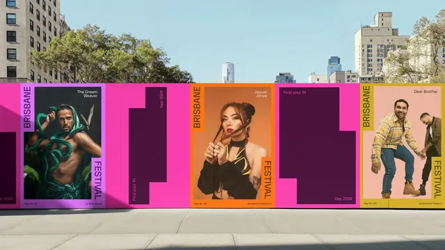
Street billboard with vibrant neon-pink, orange, and purple vertical panels displaying portrait photography for a music festival or cultural event.
Summary
A street billboard divided into modular vertical panels using neon magenta, burnt orange, and purple to showcase model portraits, designed for a music festival or cultural event.
Visual description
A large outdoor billboard composed of four vertical color-blocked sections. From left to right: a neon magenta panel with "The Dream" text and a male portrait lit with green fill; a dark purple section with centered typography; a burnt-orange panel featuring a female portrait with "Jaguar Jaze" text; and a beige-to-yellow gradient panel with two male figures and "Dear Brother" text. Each section displays the "BRISBANE FESTIVAL" wordmark rotated vertically in contrasting colors (magenta, orange). The typography is clean sans-serif with white and light-colored text. Dates appear at the bottom ("Sep 16-21"). Clear negative space (dark purple blocks) alternates with photographic sections, creating visual rhythm and enforcing the modular grid.
Key takeaway
Use neon color-blocking on bold brand wordmarks rotated 90 degrees to create visual hierarchy and identity across modular sections. High-contrast portrait photography against solid color backgrounds reads clearly from distance. Alternating dense and sparse sections (photo vs. negative space) prevents the grid from feeling monotonous.
Reuse notes
Strong for event campaigns, festival promotions, and large-scale outdoor advertising where visual impact and legibility at distance matter. The modular approach works well for multi-event lineups or rotating content. Pair with photography-driven narratives and bold, sans-serif logotypes that tolerate rotation.
More like this

Keep what you find
A free account saves references to boards and can send you a weekly email of picks based on what you save.
To see every result, go Pro.