Preview image. Unlock full-res
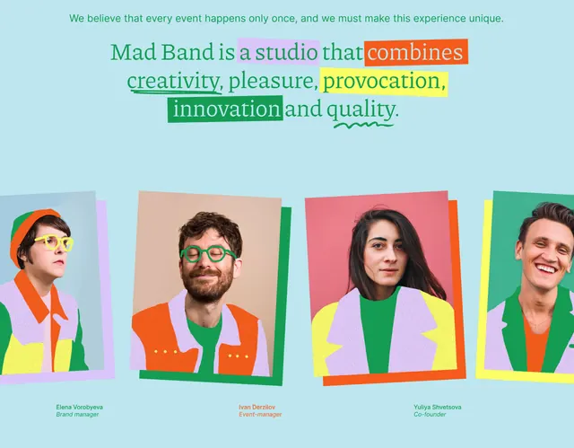
A studio identity combining oversized, multi-colored typography with portrait photographs framed in vibrant color blocks on a soft turquoise background.
Summary
A studio identity combining oversized, multi-colored typography with portrait photographs framed in vibrant color blocks on a soft turquoise background.
Visual description
The composition centers on a statement headline in all lowercase, set in sans-serif: "Mad Band is a studio that" in teal, followed by "combines" in a red box, "creativity, pleasure, provocation," in teal, "innovation" in a green box, and "and quality" in yellow, with the last word underlined. Below sits a horizontal row of four portrait photographs, each 3-4 inches wide, cropped and mounted on colored rectangular backgrounds: soft peach, coral-orange, hot pink, and deep green. The figures are shown head-to-shoulder wearing bold knitwear in complementary colors. The entire composition sits on a light turquoise background. Small text beneath each portrait indicates "role" information.
Key takeaway
The system of color-blocked boxes as emphasis rather than the type itself; the pairing of portrait crops with vibrant frame colors; and the horizontal rhythm of repeated portrait elements anchoring editorial text above. The combination of lowercase semantic text with strategic color highlights reads as both playful and intentional.
Reuse notes
Effective for agency, creative studio, or team-focused brands where personality and energy matter as much as professionalism. Works best when portraits are genuinely expressive. The color blocking extends to become a secondary brand system.
More like this

Keep what you find
A free account saves references to boards and can send you a weekly email of picks based on what you save.
To see every result, go Pro.