Preview image. Unlock full-res
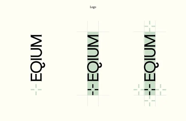
Typographic identity with a vertical wordmark and accompanying modular grid construction system showing precise alignment and scale variations.
Summary
A design system identity with a tall, condensed wordmark and accompanying construction rules showing how a sage-green modular grid supports the letterform.
Visual description
Three versions of the wordmark "Equitum" arranged left to right, each taller than it is wide. The first is black on white; the second shows the same mark with sage-green accent shapes and construction grid lines overlaid; the third shows a fully expanded modular grid system with alternating green and white squares, all centered on invisible baseline and centerline guides. The composition demonstrates strict vertical alignment, clean mono-line sans-serif, and the relationship between the typographic mark and its underlying structural system.
Key takeaway
The visible construction grid as a way to explain and extend the identity. The single accent color (sage green) used sparingly but systematically. The elegant proportions of the condensed letterforms and the generous breathing room in the overall composition.
Reuse notes
Ideal for design studios, tech companies, and B2B brands that want to project technical sophistication and precision. The grid-and-system documentation approach works well when shared internally or in guidelines. The monochrome palette with one warm neutral accent is timeless and adapts to any industry.
More like this







Keep what you find
A free account saves references to boards and can send you a weekly email of picks based on what you save.
To see every result, go Pro.