Preview image. Unlock full-res
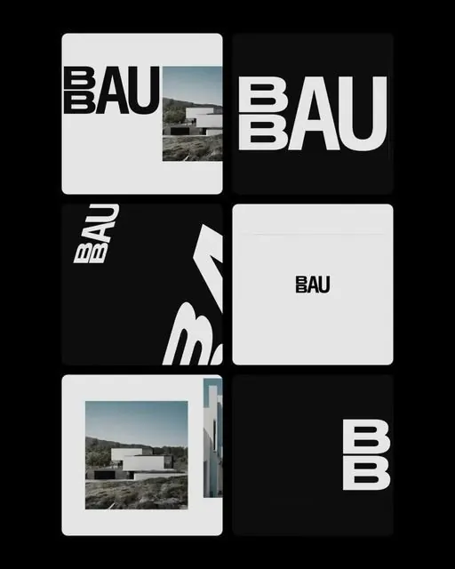
A six-module brand grid for an architecture studio pairing a stacked double-B BAU wordmark in heavy condensed sans with cropped concrete-house photography, all in black and off-white.
Summary
A brand-identity board for an architecture studio "BAU", built as a six-tile grid that alternates the wordmark with cropped photography of a minimalist concrete house. The defining move is the stacked double-B lockup: two small B's set vertically ahead of a full-size "AU".
Visual description
Six rounded-corner tiles arranged 2 columns by 3 rows on a black field, alternating black and off-white backgrounds. The "BAU" logotype runs in a heavy condensed grotesque, with the two B's stacked tightly together at left then "AU" at full height, so the mark reads as one dense unit. Top-left tile insets a small photo of a flat-roofed modern house in a landscape; the middle-right tile shrinks the wordmark to a centered business-card scale; the lower-left frames the same architecture shot inside a white border like a print. Two tiles tilt the wordmark on a slant for motion. Strictly black, white, and a mid-grey, no accent color.
Key takeaway
The stacked double-B device that turns repeated initials into a compact custom monogram rather than just bigger type. Also the tile system itself: one wordmark shown at full-bleed, card-scale, slanted, and paired with photography proves an identity flexes across sizes and contexts on a single board.
Reuse notes
A strong template for an architecture, property, or design-studio identity presentation, or a moodboard slide showing how one mark behaves at different scales. The monochrome palette leans austere, so pair it with genuinely good photography to keep it from feeling cold. Works best where the brand has repeated or doubled letters worth stacking.
More like this





Keep what you find
A free account saves references to boards and can send you a weekly email of picks based on what you save.
To see every result, go Pro.