Preview image. Unlock full-res
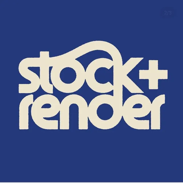
1970s-inspired software brand mark combining thick rounded letterforms with an integrated plus symbol on a deep navy square.
Summary
A retro wordmark for "stock+render" rendered in thick, rounded sans-serif with a geometric plus sign integrated into the letterforms against navy blue.
Visual description
Square composition on a solid deep navy blue (#24397C) background. "stock+render" rendered in thick, fully-capitalized, rounded sans-serif in a warm cream color. The plus symbol is seamlessly integrated between "stock" and "render," part of the same typographic family. Letter spacing is wide and even, creating a confident, monolithic presence. Heavy stroke weight and rounded terminals give the mark a distinctly 1970s display-type personality. Centered alignment on the square, leaving generous margins.
Key takeaway
The integrated plus symbol avoids a disconnected secondary element, merging functional meaning with type form. Thick, uniform stroke weight creates unmistakable bold presence. The navy-cream duotone is high-contrast and immediately memorable; the combination reads retro without feeling dated or ironic.
Reuse notes
Excellent for software, SaaS, or design-tool brands seeking a distinctive, confident identity with retro warmth. The wordmark approach (no separate icon) works well at small sizes and is adaptable to social, web, or print. The geometric relationships hold up as a monogram if needed. Best deployed on backgrounds where high contrast is maintained.