Preview image. Unlock full-res
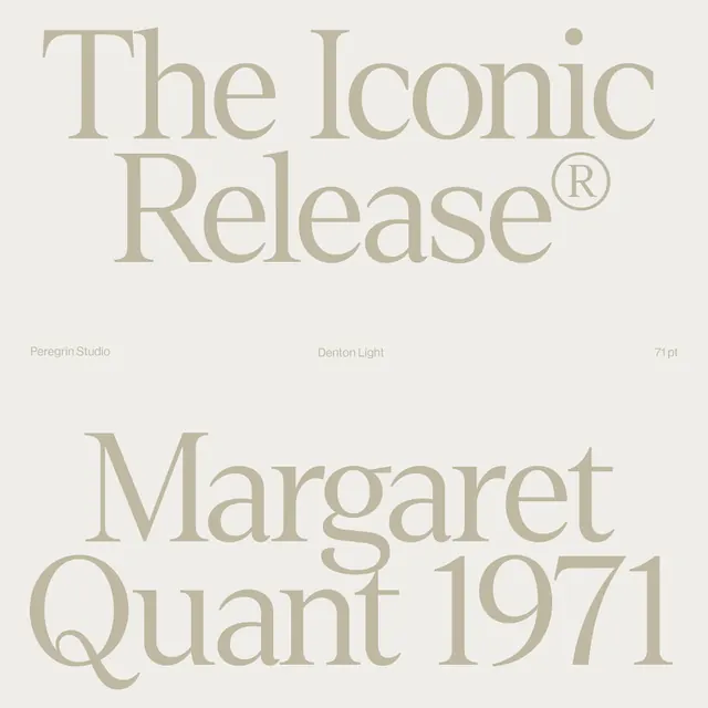
A type specimen for the Denton serif setting 'The Iconic Release' and 'Margaret Quant 1971' in huge taupe letters on cream, split by a tiny metadata row.
Summary
A tonal type specimen for the Denton serif, where two oversized taupe phrases nearly bleed off a cream square and a single thin caption line carries all the technical detail.
Visual description
Two blocks of giant high-contrast serif type sit in soft warm taupe on a near-matching cream ground, so the letters read as low-contrast and tonal rather than stark. The top block sets "The Iconic" / "Release" with a circled-R registered mark; the bottom sets "Margaret" / "Quant 1971," letters running edge to edge. Between them runs a single thin caption row in tiny grey type, evenly tracked across three points: "Peregrin Studio" left, "Denton Light" centered, "71 pt" right. The contrast between the cinematic display type and the whispered metadata line is the whole layout.
Key takeaway
Setting display type only a shade darker than its background makes a specimen feel expensive and editorial instead of loud. The lone three-column metadata strip (studio / weight / size) does the labeling work that would otherwise clutter the page, and acts as a quiet horizon between the two type masses.
Reuse notes
A clean template for a foundry release, a brand type page, or any portfolio showcasing a serif. The tonal cream-on-cream only works when the typeface has enough thick-thin contrast to hold its shape at low color contrast; on a thin sans it would disappear. Pair with generous margins and let the letters crop.
More like this
Keep what you find
A free account saves references to boards and can send you a weekly email of picks based on what you save.
To see every result, go Pro.