Preview image. Unlock full-res
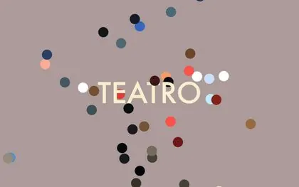
Minimalist editorial composition with the word TEATRO centered in off-white sans-serif surrounded by a loose constellation of small colored circles scattered across a warm taupe background.
Summary
A minimalist typographic composition with TEATRO in cream sans-serif positioned at the optical center, surrounded by an asymmetric scatter of small colored circles (teal, navy, tan, coral, pink, white) floating across a warm taupe canvas.
Visual description
The canvas is filled with a warm, muted taupe background. The word TEATRO is positioned slightly off-center in a clean, proportional sans-serif typeface in a cream or off-white color, appearing substantial and calm. Around the text, approximately twenty small circles in varying sizes and colors (dark navy, teal, tan, coral, pink, salmon, white, deep red-brown) are distributed in a loose, seemingly random pattern that nonetheless feels balanced. The circles appear to drift around and beneath the text, with some overlapping the letterforms and others floating in negative space. The overall effect is contemplative and slightly whimsical, suggesting either a cultural institution or experimental arts venue.
Key takeaway
The balance between visual calm and subtle playfulness through restrained use of accent colors. By scattering colors across a neutral background rather than using them in a structured grid or pattern, the design feels organic without being chaotic. The off-white typography holds clear hierarchy despite the surrounding elements. This approach proves that editorial branding need not be either purely rational or purely expressive; gentle asymmetry can convey both sophistication and warmth.
Reuse notes
Well-suited for cultural institutions, galleries, theater companies, or media brands seeking contemporary credibility without coldness. The taupe-neutral palette appeals to design-conscious audiences; highly saturated versions would read as trendy rather than timeless. Requires confident spacing and typography to avoid appearing accidental; every circle's position and every letter's proportion matter. Works at poster scale and in small digital formats due to clear focal point. Avoid pairing with serif fonts or heavily textured backgrounds, which would compete with the dot pattern's graphic presence.
More like this




Keep what you find
A free account saves references to boards and can send you a weekly email of picks based on what you save.
To see every result, go Pro.