Preview image. Unlock full-res
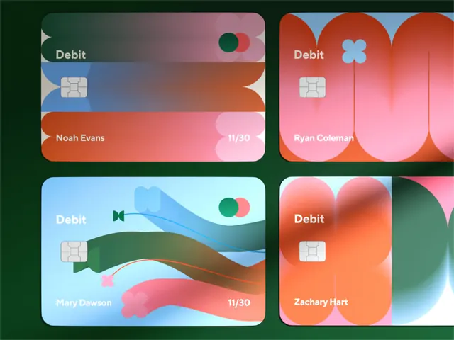
Four payment card designs using flowing gradients and organic shapes as decorative elements, each with distinct color palettes.
Summary
Four payment card designs using flowing gradients and organic shapes as decorative elements, each with distinct color palettes ranging from coral and pink to blue and green.
Visual description
A 2x2 grid of debit card mockups, each with a unique gradient background and organic wavy shapes. Top-left: coral-to-pink gradient with green and coral circular motifs; cardholder "Noah Evans" and chip in lower left. Top-right: red-to-pink gradient with light blue flower shape; "Ryan Coleman" label. Bottom-left: light blue-to-teal gradient with navy wavy bands and coral flower accents; "Mary Dawson" shown. Bottom-right: orange-to-pink gradient with teal blob shapes; "Zachary Hart" labeled. All cards feature centered white "Debit" labels and embedded payment chips. Sans-serif typography in white; organic shapes layered beneath text elements for visual texture without obscuring legibility.
Key takeaway
The use of organic, flowing shapes as background texture that feels personal and modern without competing with functional text. Gradient palettes that shift across multiple cards while maintaining visual cohesion. The balance between decorative movement and information hierarchy.
Reuse notes
Ideal for fintech or payment products wanting to feel approachable rather than corporate. Works especially well when designing a suite of cards for different user segments or account types, each with a distinct but complementary color story.
More like this





Keep what you find
A free account saves references to boards and can send you a weekly email of picks based on what you save.
To see every result, go Pro.