Preview image. Unlock full-res
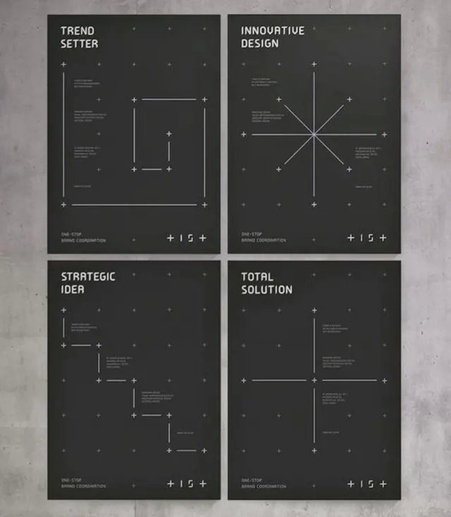
Four-panel monochromatic illustration using orthogonal geometry: concentric rectangles, crossing lines, and axis-point markers to diagram strategic concepts.
Summary
Four-panel monochromatic illustration using orthogonal geometry: concentric rectangles, crossing lines, and axis-point markers to diagram strategic concepts.
Visual description
Four equal panels arranged in a 2x2 grid over a light concrete or stone texture. Each panel has a dark charcoal background with white geometric line work. Panel headings in minimal sans-serif capitals: "TREND SETTER" (top-left), "INNOVATIVE DESIGN" (top-right), "STRATEGIC IDEA" (bottom-left), "TOTAL SOLUTION" (bottom-right). Each panel contains a different geometric diagram: rectangular frames with corner marks, crossing cardinal axes with radial lines, vertical and horizontal elements anchored by small plus-sign markers. Subtle small-caps body text (illegible at this scale) appears within or below the diagrams. A centered plus symbol and coordinate notation appears at the bottom of each panel. The overall effect is a modular, instructional system for diagramming ideas.
Key takeaway
Geometry as a neutral, universally readable language for complex ideas. The plus-sign markers and corner anchors create visual rhythm without pictorial content. The four-panel structure allows comparison and progression of thinking, useful for presentations or strategic frameworks. Monochrome palette keeps focus on structure, not aesthetics.
Reuse notes
Excellent for consulting decks, strategy frameworks, process diagrams, and B2B branding. The technical neutrality works for serious, analytical audiences. Readable in grayscale and at small sizes. The modular system scales to 6 or 9 panels if needed. Avoid using for consumer-facing work without tempering with color or softer geometry; the brutalist line weight reads very institutional.
More like this








Keep what you find
A free account saves references to boards and can send you a weekly email of picks based on what you save.
To see every result, go Pro.