Preview image. Unlock full-res
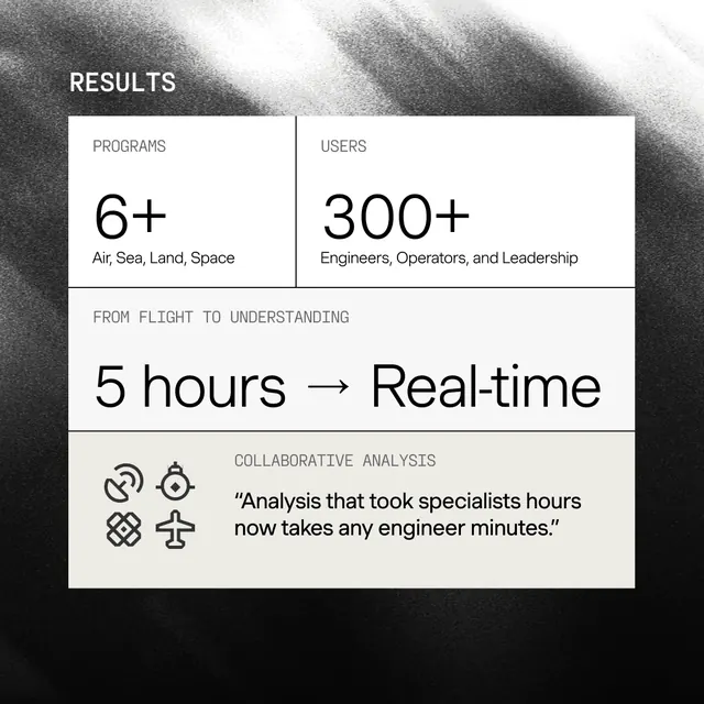
High-contrast metrics slide presenting engineering/leadership statistics with paired symbol icons and sans-serif type over a dark gray and white composition.
Summary
A data-metrics slide for engineering or consulting narratives, using paired symbol icons and high-contrast sans-serif type to present three key statistics: 6+ engineers, 300+ hours, and 5-hour time-saving claim.
Visual description
A split dark-gray and white composition with left and right halves presenting mirrored statistics. On the left: "RESULTS" label, "6+" stat with icon pair, and subtitle "Engineers, Operators, and Leadership." On the right: "300+" and "5 hours → Real-time" with their own icon pairs. A small section header reads "FROM FLIGHT TO UNDERSTANDING" and the bottom states an analysis framework claim about specialist hours becoming engineer minutes. All typography is sans-serif and tightly letter-spaced; icons are simple line symbols in dark gray. Ample negative space surrounds text blocks.
Key takeaway
The symmetrical layout that pairs data metrics with dual icons, reinforcing the message through repetition. The typographic hierarchy that subordinates the claim text to large data figures. Using ample contrast and white space to make metrics scannable at a glance.
Reuse notes
Effective for consultant, analyst, or technical product presentations. The icon pairing works for any comparative or complementary metric pairs (before/after, two-factor, team composition). Works best with 2-4 key stats; more than three make the layout cramped.