Preview image. Unlock full-res
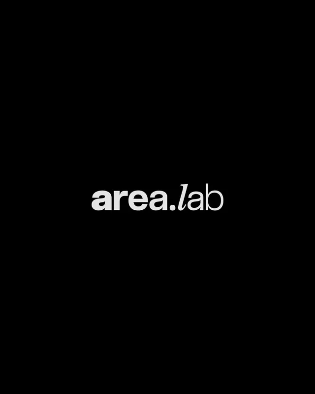
Minimal wordmark with 'area' in bold and 'lab' in italic, centered white text on pure black.
Summary
Minimal wordmark with 'area' in bold and 'lab' in italic, creating visual rhythm through weight contrast against pure black.
Visual description
White text centered on a pure black background. The wordmark 'area.lab' uses a sans-serif typeface with distinct weight variation: 'area' rendered bold and solid, 'lab' in a lighter italic. A small period separator sits between the two parts. The composition is stark and symmetrical, with generous negative space above and below the centered mark. The high contrast and austere black field create an impression of clarity and technical precision.
Key takeaway
The weight-contrast strategy between two name parts signals sophistication without ornamentation. Pure black-and-white reduction forces legibility and memorability across scales. The italic 'lab' adds personality to an otherwise rigid structure.
Reuse notes
Effective for tech, developer tools, and research-focused brands that need to feel innovative yet trustworthy. Works at small sizes due to extreme contrast. The two-part structure suits names with descriptive second words (tools, labs, studios).