Preview image. Unlock full-res
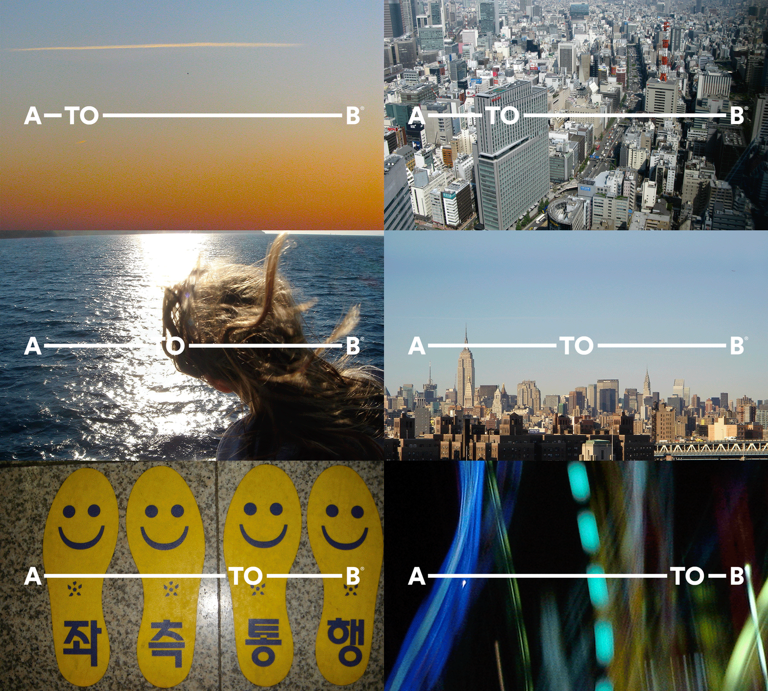
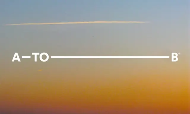
Brand wordmark connected by a horizontal line that bisects a multi-directional color gradient shifting from cool blue-grey at the top to warm orange at the bottom.
Summary
Text-based identity that uses a single horizontal line to connect a two-part wordmark, positioned over a soft color gradient that transitions from cool slate blue at the top to warm burnt orange at the bottom.
Visual description
The wordmark "A-TO-B" with a registered trademark symbol appears in clean, white sans-serif on a horizontal line that extends across the full width of the composition. The line itself functions as a visual connector and typographic element, creating a structured directional flow. Behind and below the type, a smooth gradient field shifts from cool blue-grey and pale slate tones in the upper portion through warmer golden-tan tones in the middle to rich burnt orange and deep sienna at the bottom. The gradient is subtle and atmospheric, with soft, almost imperceptible transitions between color bands. The overall composition is centered and balanced, with generous whitespace above the wordmark.
Key takeaway
Using a single structural element (the horizontal line) as both a typographic connector and compositional anchor. Building a multi-directional gradient that shifts across complementary color families (cool to warm) to create visual depth without introducing unnecessary elements. Restraint in palette and form to achieve a serene, approachable identity.
Reuse notes
Strong choice for service-based, creative, or agency brands seeking calm professionalism. The horizontal line structure works as a flexible mark that can scale from mark to full identity lockup. The gradient background technique translates well to digital applications and provides visual interest without clutter.
More like this





Keep what you find
A free account saves references to boards and can send you a weekly email of picks based on what you save.
To see every result, go Pro.