Preview image. Unlock full-res
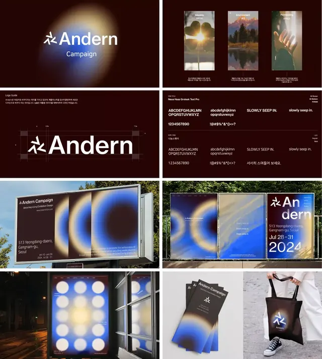
Comprehensive campaign identity centered on a glowing warm-to-blue gradient motif applied across logo, type system, environmental signage, and merchandise.
Summary
Andern Campaign identity system: a minimal dark brand unified by a glowing golden-to-blue radial gradient, applied to logo, type specimen, outdoor signage, printed materials, and merchandise.
Visual description
Six panels show the complete campaign system. Top left: logo and "Campaign" text centered on a soft blue-to-gold radial glow on dark brown background. Top right: three vertical landscape photographs with overlaid labels (Valuables, Environment, Perception), paired with a typography specimen panel showing Neue Haas Grotesk in multiple weights, cases, and language sets (Latin, Korean). Middle left: logo construction grid showing the pinwheel-like mark with precise measurement lines. Middle right: billboard signage with horizontal composition, logo at left, glowing motif background. Bottom left: illuminated outdoor installation with a 3x3 grid of circular light elements (suggesting the glowing orb abstraction), photographed at dusk with trees visible. Bottom right: printed collateral and tote bag featuring the logo and glowing gradient.
Key takeaway
The radial gradient as a unifying visual element - present but not overwhelming, it works as a background accent and brand memory marker. The restraint in typography: a single sans-serif family in multiple weights covers all communication needs. How the system scales from intimate (type specs, tote bag) to environmental (billboard, outdoor light installation) without losing identity. The dark brown/near-black background choice, which makes the warm-to-cool gradient read as premium and otherworldly rather than playful. The use of landscape photography as contextual imagery (nature, light, environment) without explicit product shots.
Reuse notes
Suited for luxury, cultural, or conceptual brands where atmosphere matters more than immediate utility. The gradient is eye-catching and memorable but not garish; works best on dark, muted backgrounds. Good for campaigns with significant environmental/experiential components (events, installations, galleries). The system requires skilled execution in each application (gradients can look cheap if poorly rendered). Not ideal for information-dense or transactional interfaces - this is a mood-and-identity brand, not a utility brand. The cool/warm gradient reads as contemporary but not trendy enough to age poorly in a few years.
More like this


Keep what you find
A free account saves references to boards and can send you a weekly email of picks based on what you save.
To see every result, go Pro.