Preview image. Unlock full-res
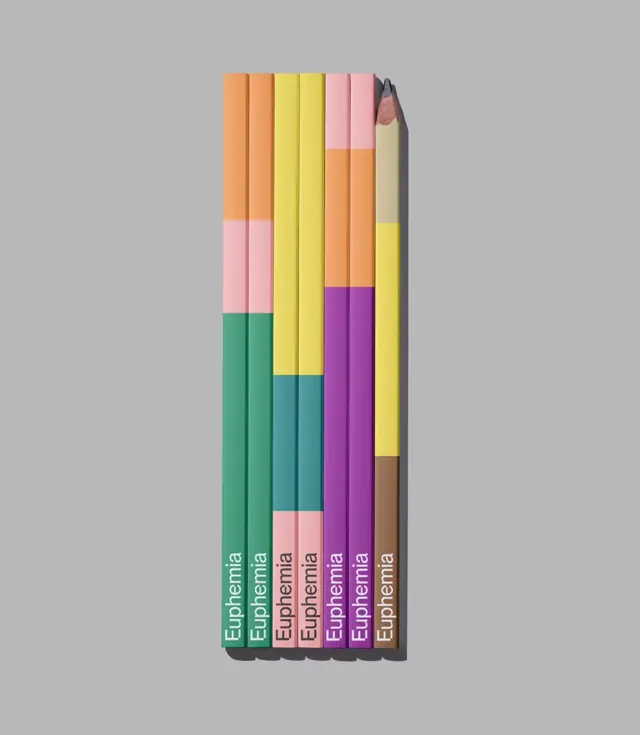
Seven branded pencils laid flat and aligned on grey, each barrel split into stacked bands of brand color with the wordmark running up the base.
More like this
See all
Summary
A top-down product frame of seven pencils in a tight row, each one a vertical color chart of the brand palette rather than a single branded color.
Visual description
The composition is portrait format on a flat mid-grey ground with a soft shadow falling to the right of the group. Seven hexagonal pencils are butted together in a vertical row, bottom edges aligned, tops staggered so the row steps upward from left to right. Only the rightmost pencil is sharpened, exposing a pale wood cone and a graphite tip; the others are cut flat. Each barrel is divided into two or three horizontal bands of solid color with hard transitions and no rules or gaps: orange over pink over green, yellow over teal over pink, pink over orange over purple, and a yellow and brown pairing with a sand section at the top. At the foot of every pencil the wordmark "Euphemia" is printed reading bottom to top in a plain grotesque sans, white on dark bands and dark on light ones. The colors are matte and uniform, with no gradients or highlights on the facets.
Key takeaway
Turning the palette into the product means one item can show the whole color system at once, and staggering the tops keeps a rigid row from reading as a single block. Flipping the wordmark from white to dark per band is the small detail that keeps the mark legible across every color.
Reuse notes
A good template for stationery and giveaway items in a brand with a wide palette, where the usual approach of one item per color would look thin. The banded barrel idea transfers to candles, packaging sleeves, cable wraps and spine design. It needs a neutral, shadow-friendly surface behind it, and the sharpened-tip detail is what stops the shot from feeling like a flat vector.