Preview image. Unlock full-res
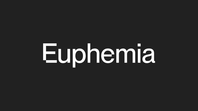
The Euphemia wordmark set large in white grotesque lowercase, centered on a flat charcoal field with no other elements.
More like this
See all

Summary
The plain wordmark presented on its own: one line of white grotesque type, capital E and seven lowercase letters, centered on charcoal.
Visual description
A flat near-black field fills the frame with no texture or gradient. The word "Euphemia" sits centered, occupying a little over half the width and roughly a fifth of the height. The face is a neutral grotesque at a single medium weight with generous, open counters, flat horizontal terminals on the e and a, a straight-sided u with no spur, and a squared dot over the i. Letter spacing is tight but even, and the round letters slightly overshoot the flat ones on the baseline and x-height. There is no symbol, no rule, no tagline and no container.
Key takeaway
The mark is doing nothing except being set well, which is the point: the identity carries its personality in the color system, so the logotype stays a neutral constant. The squared dot on the i is the only drawn detail and is enough to make the setting feel authored.
Reuse notes
Reference for a wordmark-only identity where the surrounding system, color, pattern or photography, provides the distinctiveness. Reproduce at this scale for sign-off or cover frames. Because it is a single-weight lowercase setting with no mark, it needs a strong secondary system to be memorable on its own.