Preview image. Unlock full-res
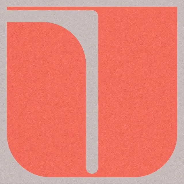
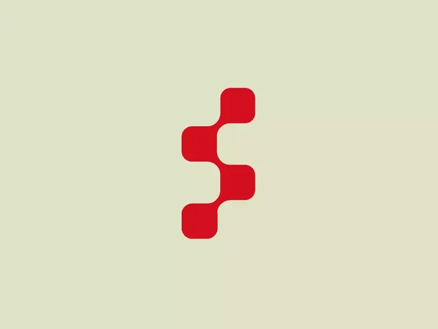
A bold red monochromatic glyph formed from four vertically stacked rounded-square shapes with organic curved connectors, creating a single unified mark.
Summary
A bold red glyph made from four vertically stacked rounded squares with organic flowing connectors, expressing motion and unity through simple geometric forms.
Visual description
Soft pale beige background. A centered red monochromatic mark: four rounded-square shapes arranged vertically, connected by curved bridges that flow smoothly from shape to shape. The proportions are balanced; connectors have generous roundedness. The overall form reads as a single cohesive icon despite its modular construction.
Key takeaway
The technique of stacking simple geometric forms (rounded rectangles) and linking them with organic curves creates fluidity and visual rhythm while staying minimal. This approach works well for motion-focused or interconnection-themed brands without adding visual noise.
Reuse notes
Ideal for fintech, SaaS, or technology brands seeking an abstract, approachable mark. Scales well at small sizes due to clear geometry. Works effectively in monochrome on neutral backgrounds; color variations could enhance brand extensions.