Preview image. Unlock full-res
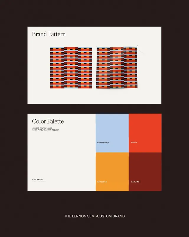
Structured brand guideline showing a repeating rectangular pattern in red, black, and blue, paired with a labeled five-color palette on cream and dark backgrounds.
Summary
Brand pattern and color system showing a rectangular tile repeat in red, black, and blue, with five named swatches displayed as proportional blocks below.
Visual description
A two-panel branding guideline on a dark background. Top panel: cream background with two identical rectangular pattern grids side by side, each made of horizontal rows of red, orange, black, and blue rectangular tiles aligned in a tight, modular system. Below: "Color Palette" header on the left, with "CLOSEST PANTONE COLOR MATCH AVAILABLE UPON REQUEST" in small text. Five color swatches fill the lower panel: cornflower blue (top left), poppy red (top right), parchment cream (bottom left), marigold orange (bottom middle), and cabernet burgundy (bottom right). Each swatch is labeled with its brand name in white sans-serif. All typography is clean and minimal, using a simple sans-serif at two weights.
Key takeaway
The pattern grid shows how a limited color-tile system repeats in proportion and alignment, making it a modular starter for brand pattern application. Labeling swatches with memorable brand names (not hex values) makes color communication more human and memorable. The split layout separates pattern usage from strict color reference, showing both concept and spec in one frame.
Reuse notes
Useful as a template for packaging brands or retail identities that need both a pattern system and a constrained color palette. The color proportions and analogous warm-to-cool split work well for printed guidelines. The note about Pantone matching is standard practice when hand-handing to production.
More like this





Keep what you find
A free account saves references to boards and can send you a weekly email of picks based on what you save.
To see every result, go Pro.