Preview image. Unlock full-res
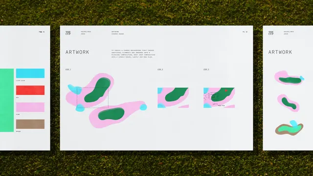
A three-page design system showcase pairing fluid organic shapes in pink, teal, and green with structured geometric frames and a supporting color palette guide.
Summary
Three pages from an art direction guide pairing amorphous organic shapes in vibrant pink, teal, and green with crisp geometric rectangular frames on a light paper background.
Visual description
Three bound pages laid flat on moss background. Left page shows a color palette swatch labeled "ARTWORK" with blocks of teal, cyan, hot pink, red, salmon, and olive, organized vertically. Center spread features organic blob forms (pink, green, teal, olive) loosely aligned within squared rectangular frames arranged in a grid; each frame labeled with "Grid 1," "Grid 2," "Grid 3." Right page displays three isolated organic shapes in pink, teal, and gradient teal-to-olive, positioned vertically with similar rectangular frame references. All pages use clean sans-serif typography at small scale and ample off-white negative space.
Key takeaway
Pairing rigid geometry (the frames) with soft, free-flowing shapes (the blobs) creates dynamic tension that reads sophisticated rather than childish. The color palette swatch as a dedicated page establishes the system's constraints upfront. Labeling frames numerically (not descriptively) lets viewers understand the grid logic without didactic language.
Reuse notes
Strong reference for creative direction decks, portfolio guidelines, or art direction systems for illustrators and designers. The palette works well for playful yet controlled brands (education, creative services, design tools). Keep the organic shapes large and the geometry crisp to maintain the balance; too much either way loses the charm.
More like this



Keep what you find
A free account saves references to boards and can send you a weekly email of picks based on what you save.
To see every result, go Pro.