Preview image. Unlock full-res
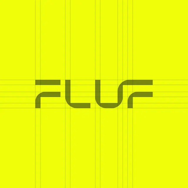
A tech-forward logo combining bold rounded sans-serif type and an olive accent bar, organized within a neon-yellow grid system.
Summary
A geometric wordmark for a technology brand using a heavy rounded sans-serif logotype with an olive accent bar, set within a fine vertical and horizontal grid that fills a neon-yellow square.
Visual description
Neon bright yellow square background subdivided by a regular grid of thin vertical and horizontal lines in medium gray-green, creating a structured matrix across the entire canvas. Centered within this grid sits the word "plur" rendered in a bold, rounded geometric sans-serif with uniform stroke weight and smooth, modernist letterforms. An olive-colored horizontal bar intersects the composition slightly above the text baseline, aligning with the grid lines. The grid itself is a visible structural element, suggesting modular design systems and digital scaffolding.
Key takeaway
The grid is not decoration but framework, signaling systematic thinking and digital-native branding. The rounded geometric letterforms balance mathematical precision with approachability. The single olive accent bar demonstrates restraint while breaking the monochromatic field. The square format with grid makes this instantly recognizable as a locked application icon or digital identity system.
Reuse notes
Strong choice for tech startups, software products, design tools, or any brand that values systematic design and digital-first identity. The grid treatment works especially well in icon/favicon applications or as a moodboard element. Less effective for physical/environmental applications where the fine grid detail would be lost.