Preview image. Unlock full-res
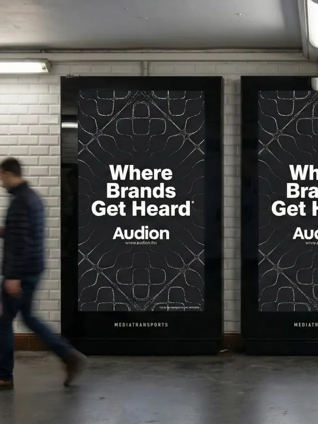
Large-format subway poster advertising Audion ('Where Brands Get Heard'), white sans-serif type on black with subtle geometric wireframe background pattern.
Summary
Transit advertising campaign for Audion (audio platform) displayed as large subway posters: bold white headline type centered on jet-black ground with a subtle geometric wireframe pattern, minimalist layout.
Visual description
Two identical tall billboard/poster frames dominate the image, mounted in a white-tiled subway station. Each poster is jet-black with a subtle all-over pattern of connected geometric lines (thin white wireframe, tessellated angular shapes, symmetrical and mathematical). Centered in large, heavy sans-serif type, the headline reads "Where Brands Get Heard" in white. Below, "Audion" appears in slightly smaller caps, followed by the URL "where.audion.fm" in small letterform. At the poster's bottom edge, white text credits "MEDIATRANSPORTS". A person in dark clothing walks in front, providing scale. White subway tiling and a metal rail are visible in the background. The composition is stark, typography-driven, and relies entirely on monochromatic contrast.
Key takeaway
The restraint of using a subtle geometric background pattern without letting it overshadow the headline; the hierarchy of size and weight (large headline, smaller URL/brand, tiny credit) on a single dark field; the geometric wireframe as texture that suggests technology or precision without explicit illustration.
Reuse notes
Strong reference for transit, billboard, or large-format advertising where type must read at distance. The monochromatic approach ensures legibility in outdoor light. The geometric underpattern adds visual interest without clutter. Works well for B2B, media, tech, or platform brands seeking a sophisticated, no-nonsense presence in public spaces.
More like this







Keep what you find
A free account saves references to boards and can send you a weekly email of picks based on what you save.
To see every result, go Pro.