Preview image. Unlock full-res
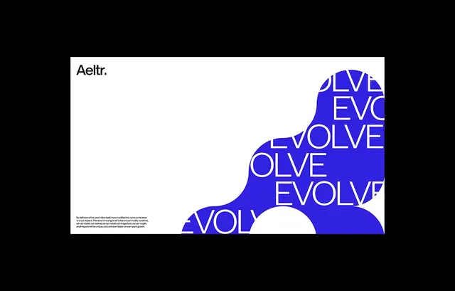
White abstract mark with overlapping organic curves forming an implied eye, anchored on a vibrant blue background, balancing fluid form with static geometry.
Summary
White organic curves form an abstract figure with a prominent eye-like void against a deep, saturated blue, suggesting motion and direction while maintaining strict minimalism.
Visual description
Two overlapping curved forms (one ascending from lower left, one descending from upper right) meet in the center, carving out a negative-space ellipse. The entire mark sits centered on a solid bright blue (hex #007BC1), with the white shape occupying roughly the right half of the field. The curves are smooth and unbroken, suggesting fluidity without serifs or sharp terminals. The eye-shaped void at the center creates depth and draws focus. The composition balances asymmetry with central grounding.
Key takeaway
The economical use of negative space to suggest both a symbol and a directional flow; the pairing of organic curves with a flat, hard-edge background color for contrast; the letterform-adjacent quality that reads as both abstract and almost speakable.
Reuse notes
Works for forward-facing, tech-enabled brands needing a single-mark identity. Pairs well with sans-serif type. Requires confident color choice; the cool blue is essential to the mark's energy. Not suitable for reversed use (white background) without redesign.