Preview image. Unlock full-res
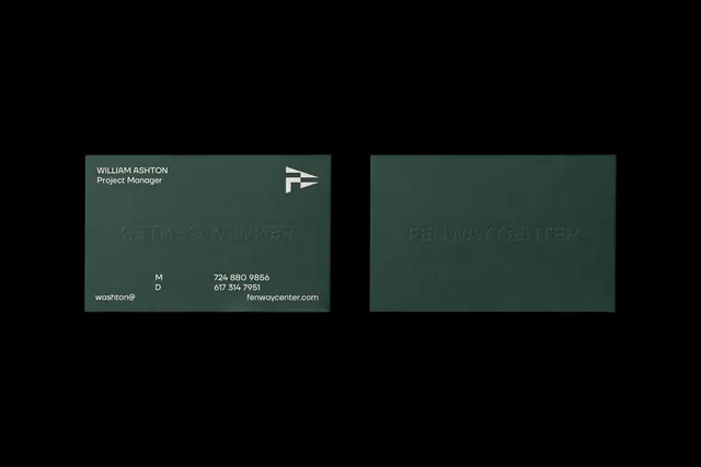
A single dark green business card shown front and back on black, combining printed contact details with a large blind-embossed wordmark.
More like this
See all
Summary
Two dark green cards on a black ground, one face up with contact information and one reverse showing only a debossed wordmark catching the light.
Visual description
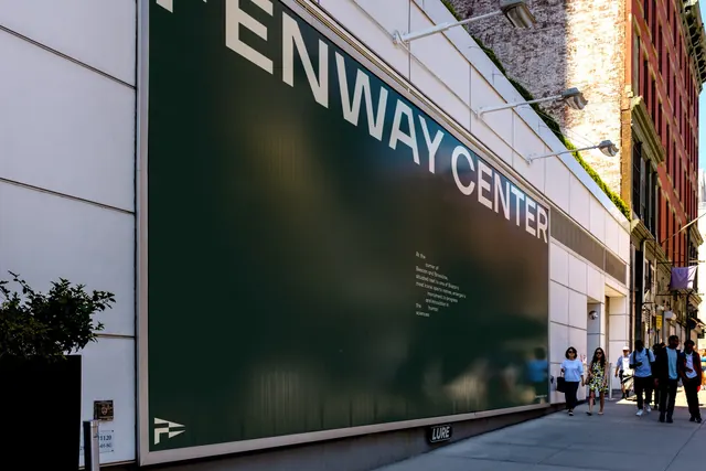
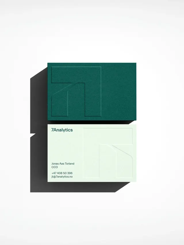
The left card carries a name and role stacked in cream sans at the top left, the cream flag monogram at the top right, and at the bottom a small block of mobile and direct numbers set in two aligned columns, with an email fragment at the far left and a domain at the far right. Across the middle, FENWAY CENTER is blind embossed at large size with no ink, visible only as a shadowed relief and reading in mirror because the impression pushes through from the reverse. The right card is otherwise blank, showing the same wordmark impression the correct way round. Both cards sit on uncoated stock with visible fiber texture, lit from above so the emboss catches a soft highlight along the top of each stroke. The surrounding black field is empty, giving the pair a lot of air.
Key takeaway
Letting the largest brand element carry no ink at all, and reading it through the sheet on the printed side, makes a plain card feel expensive without adding a second color. Splitting contact numbers into a labelled two-column block keeps the bottom edge tidy at very small sizes.
Reuse notes
Ideal for identities that want restraint at the touchpoint level: property, architecture, legal, consultancy. Blind emboss needs a heavy uncoated stock and raking light to photograph, so it is a poor choice if the card will only ever be seen flat in a digital mockup.