Preview image. Unlock full-res
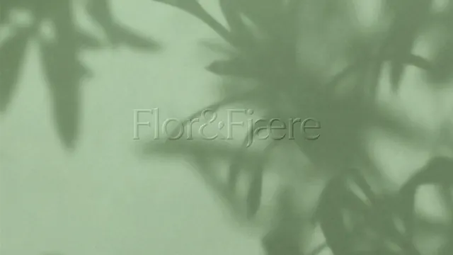
The serif wordmark blind embossed into pale green paper with the shadow of foliage falling across the surface.
More like this
See all

Summary
A tonal wordmark study: the logotype pressed into pale green paper with no ink, readable only through raised edges and the shadow of leaves across the sheet.
Visual description
The frame is a single flat field of soft sage green paper with a visible fibrous grain. The wordmark sits centred, large, running across roughly two thirds of the width, in a high-contrast serif with fine hairlines, a tight ampersand between the two words and an ae ligature near the end. It is the same colour as the paper and only registers through a thin bright edge along the top of each stroke and a matching soft shadow below, the signature of a blind emboss. Over the top half and right side, blurred shadows of pine or olive-like foliage fall across the sheet, darkening the upper right corner and the right edge while the lower left stays open and evenly lit. The shadow crosses the letterforms without obscuring them.
Key takeaway
Removing colour from the mark entirely and letting relief plus a cast shadow carry it produces a quiet, expensive-feeling brand image. The natural leaf shadow does the storytelling that an illustration would otherwise have to do.
Reuse notes
Reach for this for premium hospitality, spa and destination brands, or for a cover, endpaper or business card detail. It only works with a real print finish and raking light, and it fails outright at small sizes or on screen without a photographic capture. Pair with a louder, illustrated application elsewhere in the system so the identity does not read as only whisper-quiet.