Preview image. Unlock full-res
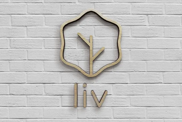
The clean primary lockup, a hand-drawn leaf mark above a widely spaced lowercase rounded sans wordmark, all in one green on white.
More like this
See all

Summary
The master lockup presented plainly: mark stacked over wordmark, one green, no background, no supporting elements.
Visual description
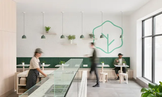
A wide white frame with the lockup centred and generous clear space on every side. On top sits the leaf mark, an open hexagon outline whose six sides each bow gently outward with a visible hand-drawn wobble, enclosing a straight vertical stem that runs from the bottom edge of the outline to just past centre, with one short branch angling up to the left and one down to the right. Below, the words liv salad are set lowercase in a geometric rounded sans with soft rounded terminals, generous letterspacing, a single-storey a, and a stroke weight that matches the mark almost exactly. The wordmark is noticeably wider than the mark, so the pair forms a stable triangle. Everything is drawn in one muted medium green with no gradients, outlines or shadows.
Key takeaway
Matching the wordmark's stroke weight to the mark's monoline is what makes the two halves read as one drawing rather than a logo plus a typeface. The wobble in the hexagon is small enough to stay geometric and large enough to feel drawn by hand, which is the whole tone of the brand in a single decision.
Reuse notes
The reference version to work from when applying this identity anywhere: signage, patterns, packaging and reversed-out treatments all derive from this lockup. The wide wordmark means it needs horizontal room, so a stacked or mark-only variant is required for narrow placements. Single-colour construction makes it safe for vinyl, embroidery and one-colour print.