Preview image. Unlock full-res
Thirteen-slide comprehensive brand identity system for Hibahihi, a Montreal yakitori restaurant, showcasing logo concepts, apparel, decorative patterns, packaging, typography, and team photography in bold black and green.

Summary
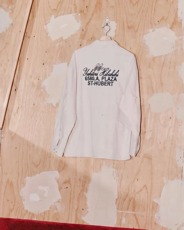
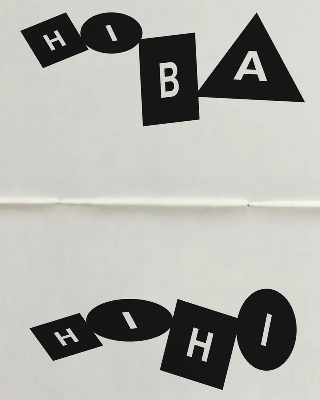
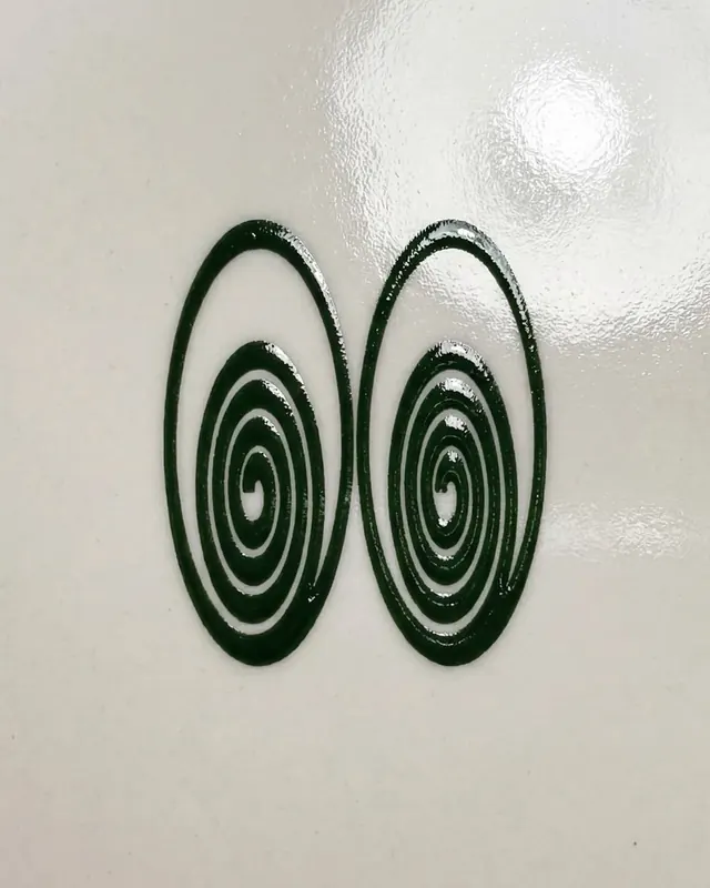
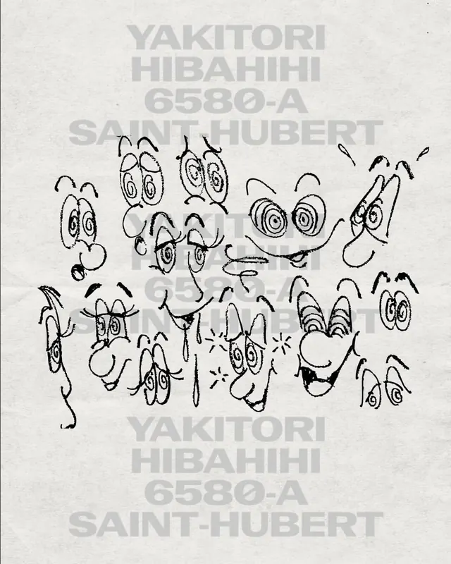
A thirteen-slide identity project (plus video) for Hibahihi, a yakitori restaurant on Saint-Hubert in Montreal. The system weaves together geometric logo concepts built from simple shapes (H, I, B, A), decorative spiraling motifs, branded apparel with embroidered text, product packaging with illustrated detail, Japanese typographic treatment, and team photography that anchors the identity as collaborative and grounded.
Visual description
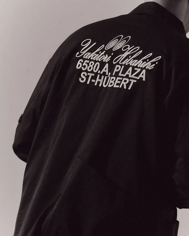
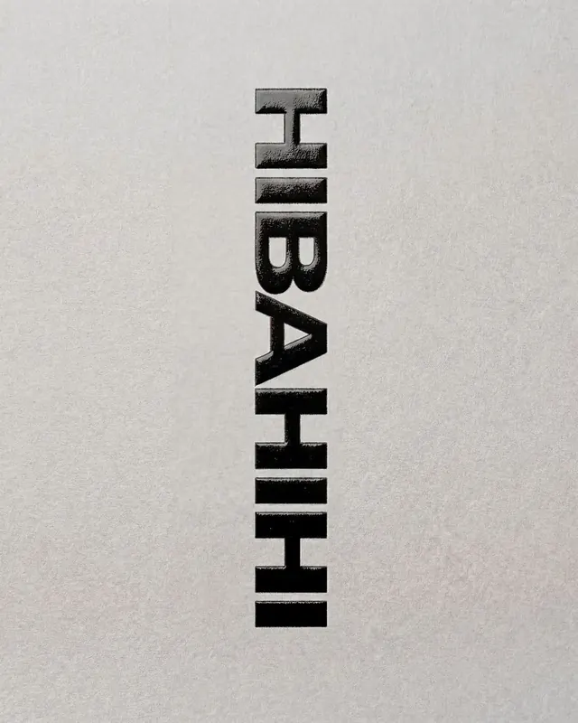
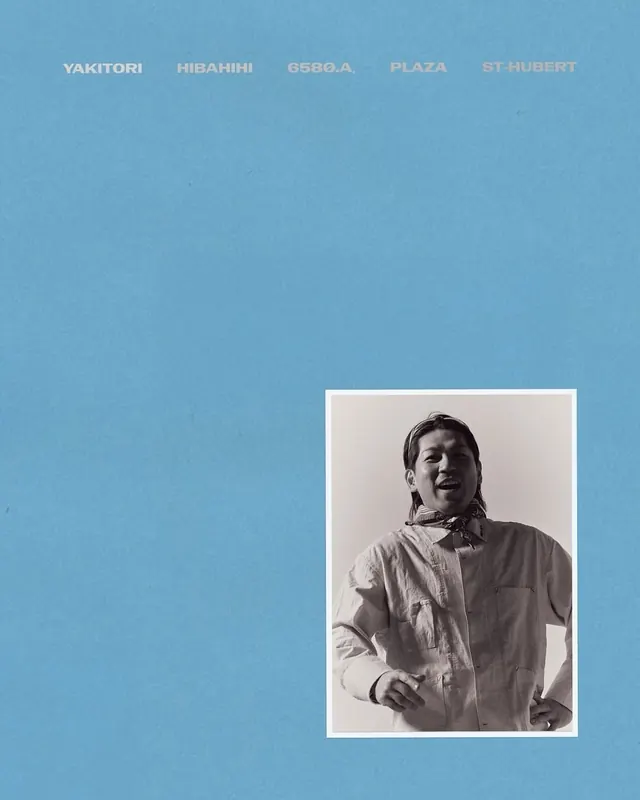
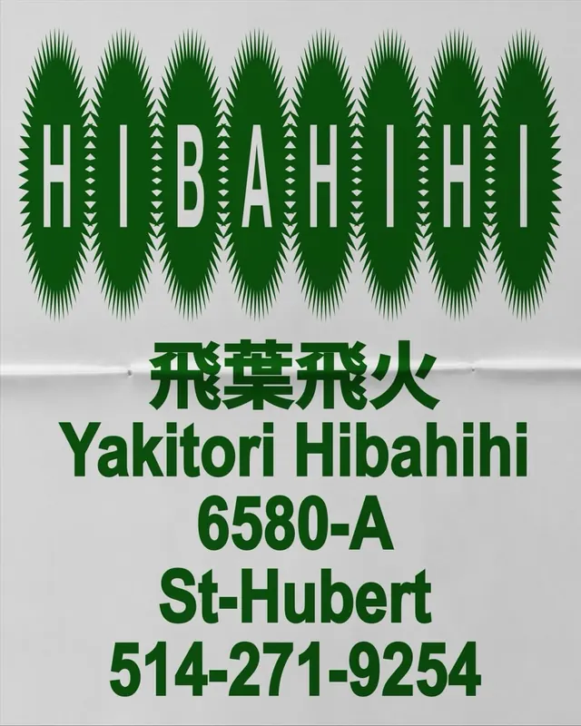
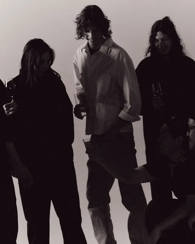
The visual language centers on geometric abstraction and high contrast. The primary logo concept reduces the restaurant name to individual letters in rotated squares, circles, and triangles, rendered in solid black on cream. A secondary visual system uses concentric circles and spiraling line patterns in dark green that suggest movement and Japanese traditional motifs. Apparel applications appear in both cream and black, with embroidered script lettering. A beer bottle features a blue label with spiraling graphics and the restaurant address. The supporting type hierarchy mixes English sans-serif and Japanese characters (yakitori written in kanji and hiragana). A full-width typographic poster displays "HIBAHIHI" in white caps over a green field of vertical spikes, evoking growth and energy. Team photography is shot in black and white, high-contrast and tightly cropped. Across the series, the color palette stays disciplined: black, white, forest green, and warm tan, creating a sophisticated yet approachable restaurant brand.
Key takeaway
The design move that carries this project is the restraint and modularity of the geometric mark. Using simple rotated shapes to spell out letters is reductive but memorable, and it scales easily across touchpoints. The secondary pattern system (spirals and concentric circles) adds ornamental richness without overwhelming the core mark. Mixing photography, illustration, and pure typography keeps the brand feeling alive and collaborative.
Reuse notes
A model identity system for independent restaurants, particularly those with cultural specificity or craft positioning. The geometric logo approach works best when the letter forms remain legible even at small scale. The green-and-cream palette reads as both contemporary and timeless. The inclusion of team photography humanizes the brand and signals that this is a place with creative intention behind it. Works well in carousel formats to show full system application across media. Video component adds motion that the still images hint at.