Preview image. Unlock full-res
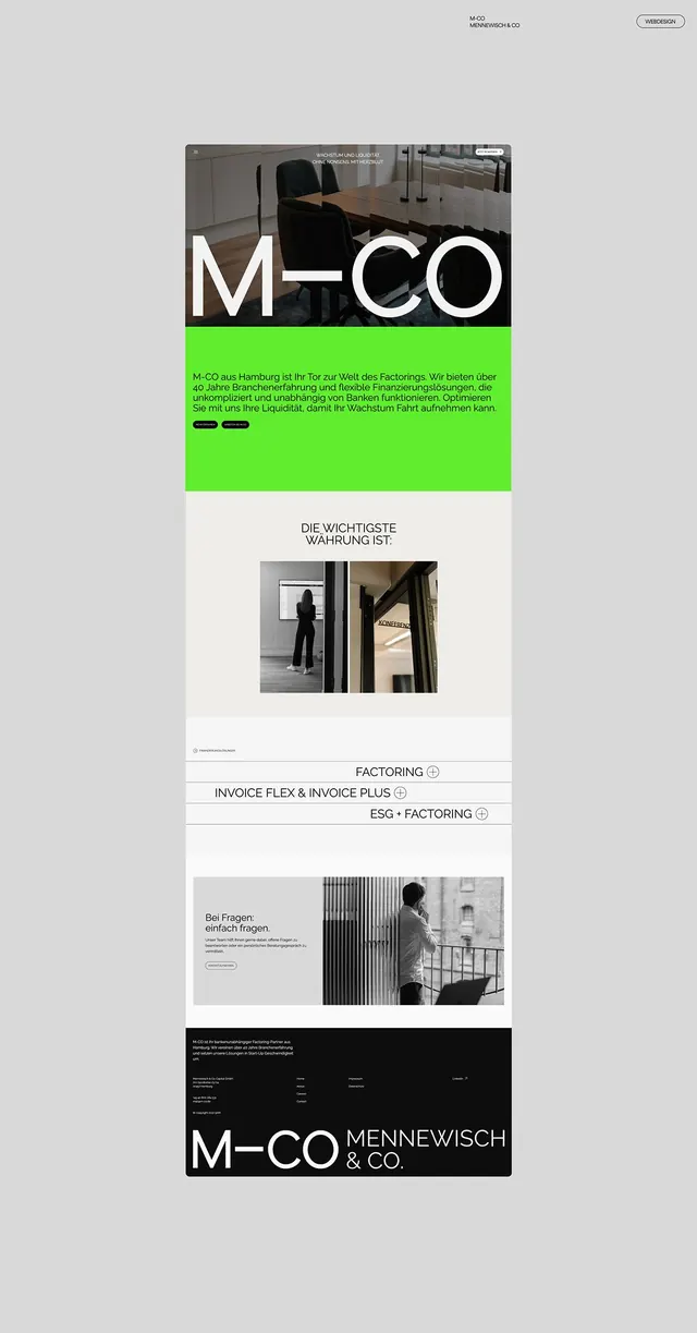
A long-scroll website concept for Hamburg factoring firm M-CO that stacks a black photo hero, an acid-green intro block, and a black footer around an oversized M-CO wordmark.
Summary
A full-page web design mockup for M-CO (Mennewisch & Co), a Hamburg factoring company, built around a giant M-CO wordmark and a single block of acid green slicing through an otherwise greyscale layout.
Visual description
The page is a tall single column on a light grey field. At the top, a dark photographic hero of an empty conference room carries the huge white "M-CO" wordmark set in a thin-stroke display sans, the hyphen styled as a long centered dash. Directly below, a saturated lime-green panel holds a paragraph of German body copy in black with two black pill buttons. Lower sections return to greyscale: a centered headline over a pair of black-and-white interior photos, then a thin-lined accordion list (FACTORING, INVOICE FLEX & INVOICE PLUS, ESG + FACTORING) with plus icons. A black footer repeats the wordmark at full bleed alongside "MENNEWISCH & CO." in a contrasting serif-like caps.
Key takeaway
One loud color block as the only chroma in a black-white-grey system, so the green reads as the brand signal without a palette. The oversized wordmark used twice, once as hero and once as footer lockup, to bookend the scroll. The hyphen drawn as a deliberate dash element rather than punctuation.
Reuse notes
A strong template for a finance or B2B services site that wants to feel editorial rather than corporate-stock. The single-accent move only works if the rest of the page stays strictly neutral. Pair with real black-and-white photography; the effect collapses with colored imagery.
More like this






Keep what you find
A free account saves references to boards and can send you a weekly email of picks based on what you save.
To see every result, go Pro.