Preview image. Unlock full-res
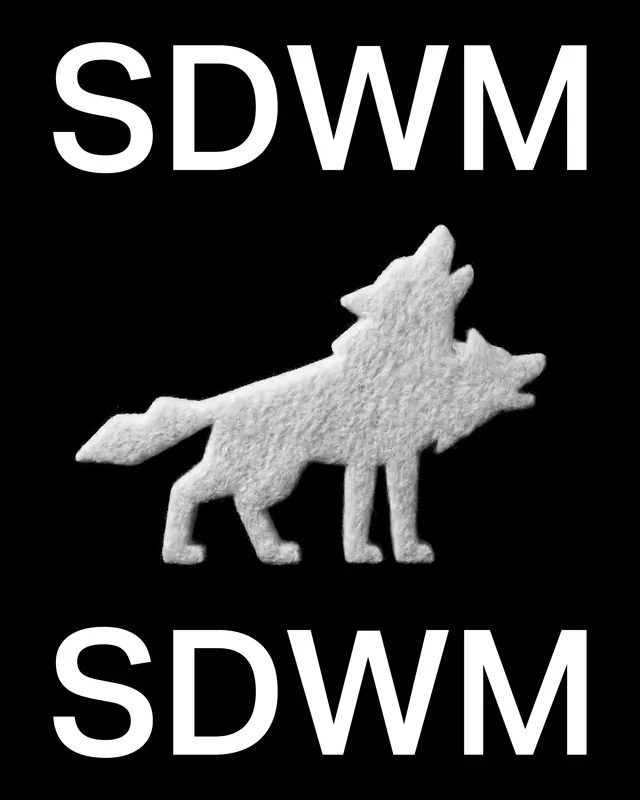
Icon design system for SickDogWolfMan brand, featuring geometric wolf silhouettes, typographic lockups, and playful applications across monochrome aesthetic.

Summary
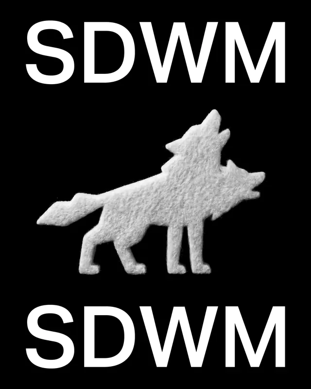
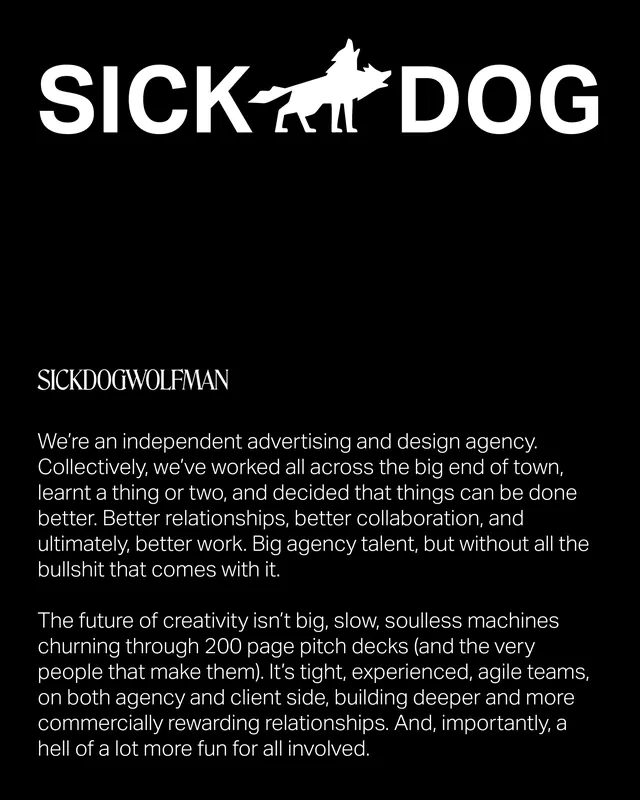
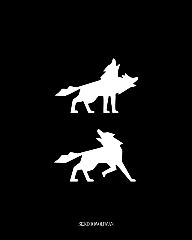
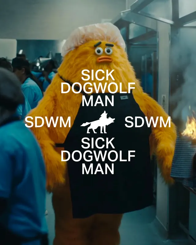
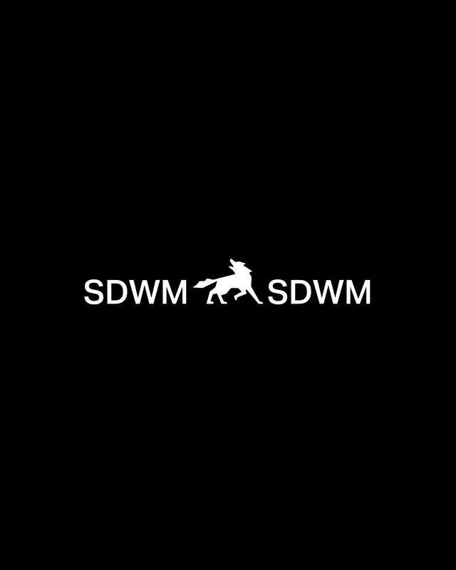
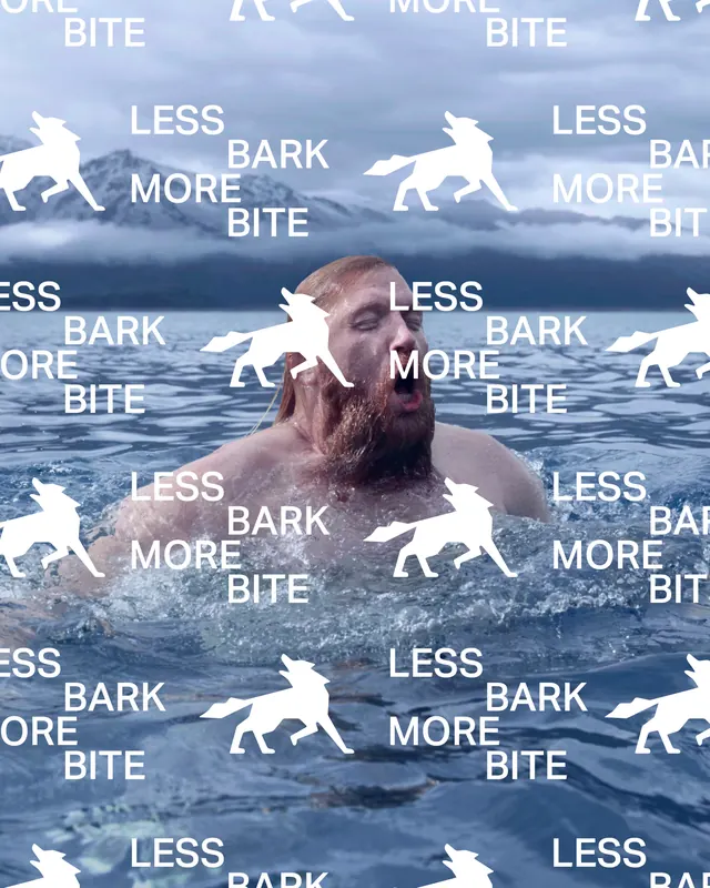
Icon design system for independent advertising and design agency SickDogWolfMan (@sickdogwolfman), built around a simplified geometric wolf silhouette with sharp ears and flowing tail. The carousel shows the mark in various contexts, color inversions, and pairing with bold all-caps typography, concluding with humorous tagline applications ("bite less, bark more") across lifestyle photography and physical media.
Visual description
Slides establish the primary mark, a clean white wolf silhouette on black background, repeated and refined across multiple layouts. Early slides show the icon paired with "SDWM" acronym and full "SICKDOGWOLFMAN" logotype in tight, modern sans-serif. Middle slides introduce icon variations in different poses and size applications. A narrative shift occurs mid-carousel with a humorous photograph of a man in the water wearing a SickDogWolfMan branded cap with overlaid text ("SICKDOGWOLFMAN," "SDWM," and the repeating tagline "BITE LESS BARK MORE BITE"), establishing the brand's irreverent, anti-corporate tone. The final slide returns to the clean icon isolated on black with video motion. The entire carousel maintains strict monochrome with white-on-black or black-on-white presentation, emphasizing clean geometry and readable mark over color variation.
Key takeaway
The wolf mark works across abstract and representational contexts without losing impact. Coupling minimal geometric iconography with bold, all-caps typography and playful messaging creates a memorable identity that stands apart from typical corporate branding. The mix of refined design system slides and humorous lifestyle applications demonstrates how to brand an agency personality through both precision and irreverence.
Reuse notes
Ideal reference for design agency branding, independent studio identities, and systems where personality and confidence are primary. The geometric wolf silhouette technique (sharp ears, flowing tail, minimalist proportions) is reusable for animal-based marks across industries. The "tight spacing + all-caps + monochrome" formula is effective for creating impact in small sizes (merchandise, social media, favicon scale). The tagline approach ("bite less, bark more") shows how to inject messaging into an otherwise abstract mark system.