Preview image. Unlock full-res
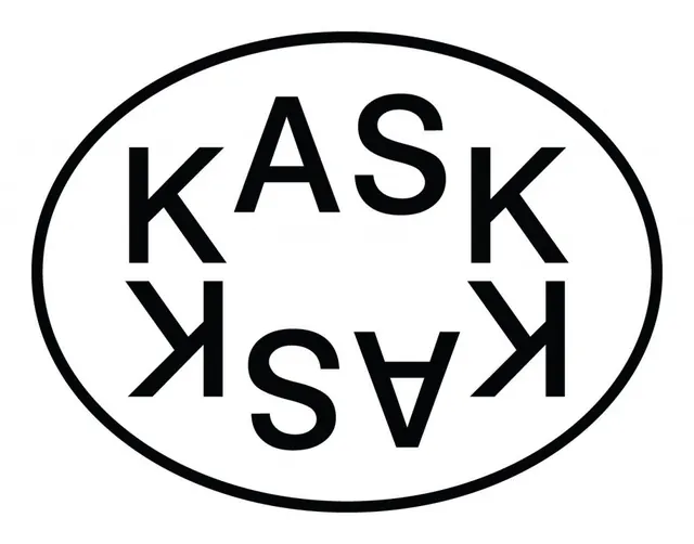
Black-on-white logo setting the word KASK twice, the lower line flipped as a mirror image, enclosed in a thin oval outline.
Summary
A logo that stacks the word KASK over its own upside-down mirror image, both set in heavy all-caps and held inside a single thin oval outline.
Visual description
A wide horizontal ellipse drawn as a hairline black stroke on white frames the mark. Inside, KASK appears twice: the top line reads upright, and the line beneath is the same word rotated 180 degrees so it sits as a vertically flipped reflection, the two meeting along an implied horizontal axis through the oval's center. The type is a bold geometric sans in solid black, the letters spaced wide so the symmetry reads instantly. The thin oval contrasts sharply with the chunky letterforms, and the white interior carries all the breathing room.
Key takeaway
The rotational mirror trick: setting the name and its 180-degree copy turns a four-letter word into a balanced, badge-like mark with no extra symbol needed. Pairing a hairline containing shape with heavyweight type creates tension and makes the lockup feel like a stamp or seal.
Reuse notes
A confident choice for an arts school, studio, or cultural brand that wants a typographic logo with a memorable structural gimmick. The oval-and-mirror construction works as a sticker, embossed seal, or single-color print. Strongest in pure black and white; the symmetry is the whole idea, so it needs the type centered precisely.