Preview image. Unlock full-res
Comprehensive visual identity system for a chef-led Porto Alegre restaurant, spanning logo, typography, color applications, environmental design, and cultural messaging across 20 slides.

Summary
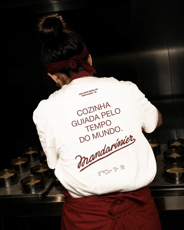
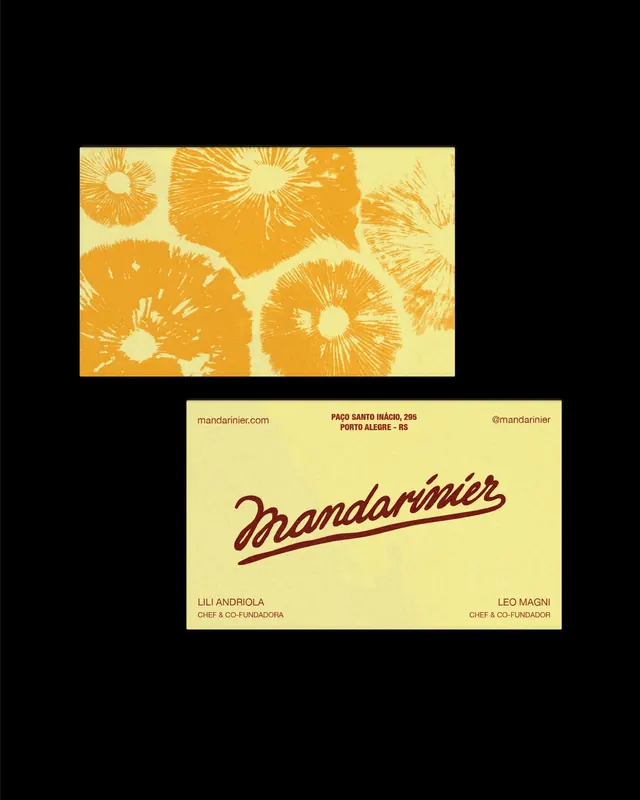
A complete visual identity system for Mandarinier, a chef-led seasonal restaurant in Porto Alegre, built around warm gold accents, a flowing script wordmark, bold serif typography, organic illustrations of produce, and cohesive environmental design applied across interior, tableware, uniforms, and print collateral.
Visual description
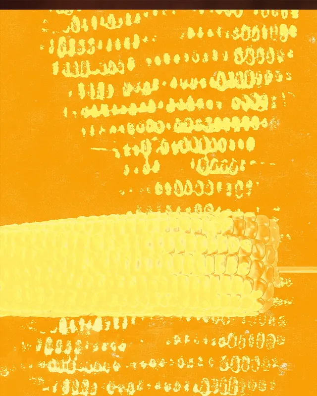
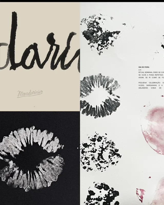
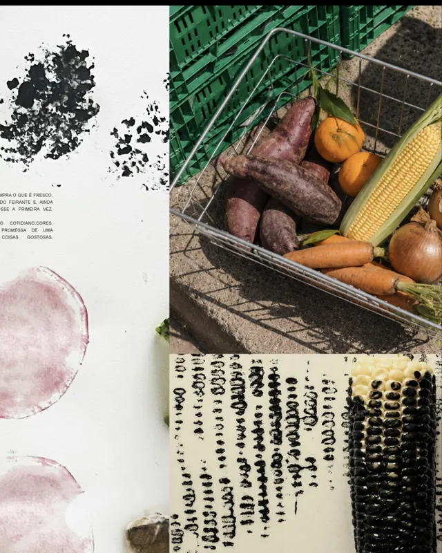
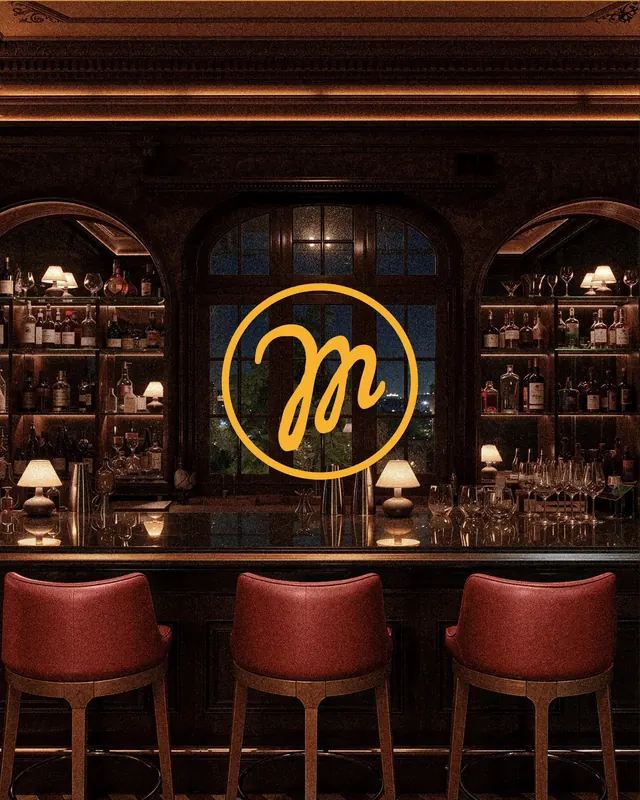
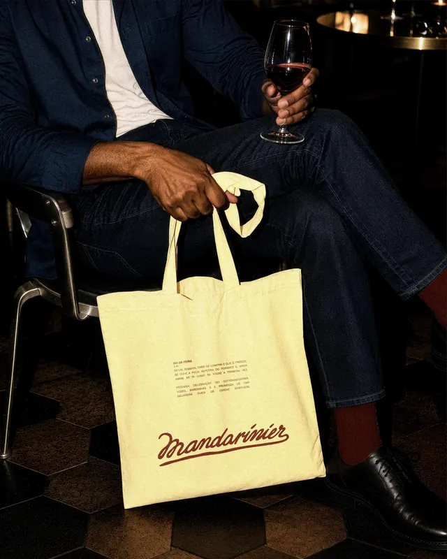
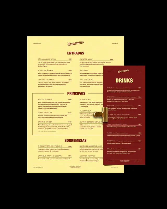
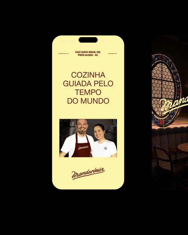
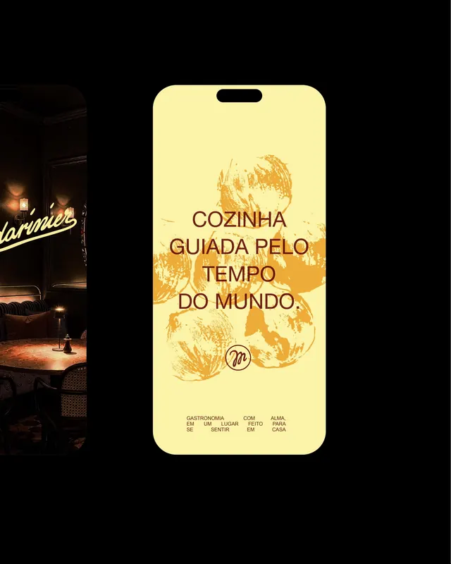
Slide progression showcases: (1) motion opener with warm gold palette establishing tone; (2) an elegant interior with art deco detailing, custom oval windows with honeycomb pattern, brass fixtures, and the gold "Mandarinier" script flowing across the space; (3-4) detailed looks at tableware, apron graphics, and signage; (5-8) brand collateral including business cards, letterhead, and menus on cream stock; (9-12) packaging and environmental graphics-gold foil stamps on kraft paper, grocery bags, produce illustrations in the brand's language (loose ink wash paintings of mandarin cross-sections, vegetables, ingredients); (13-18) printed posters, wayfinding, and cultural messaging in Portuguese about seasonal cooking and the mandarin metaphor; (19-20) motion studies and applications. Color palette clusters around warm gold (#FFC832), deep burgundy (#8B1A1A), cream, and charcoal. Typography is an italic serif script for the wordmark with supporting bold serif body text.
Key takeaway
A masterclass in cohesive system design where a single metaphor (the mandarin tree, seasonality, warmth) permeates every touchpoint without feeling repetitive. The script wordmark is immediately ownable, and the handcrafted illustration style-loose ink wash produce studies-gives the identity an artisanal authenticity that justifies premium positioning. Motion videos show the wordmark and logo living in the space.
Reuse notes
Exemplary for upscale food service, hospitality, or chef-driven concepts. The warmth and craft will read as premium without coldness; the script wordmark pairs beautifully with serif body copy and organic illustration. Environmental applications (signage, tableware, packaging) are thoroughly documented. Works across both print collateral and interior spaces. The gold and burgundy palette is seasonally flexible (works year-round but particularly strong in autumn/winter).
From this post: Mandarinier restaurant identity carousel
View post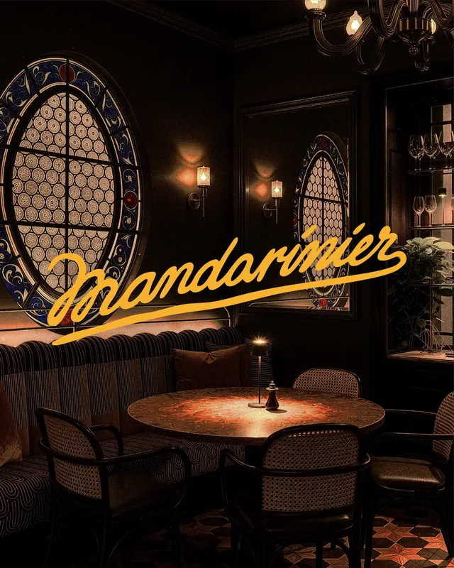


More like this

Keep what you find
A free account saves references to boards and can send you a weekly email of picks based on what you save.
To see every result, go Pro.