Preview image. Unlock full-res
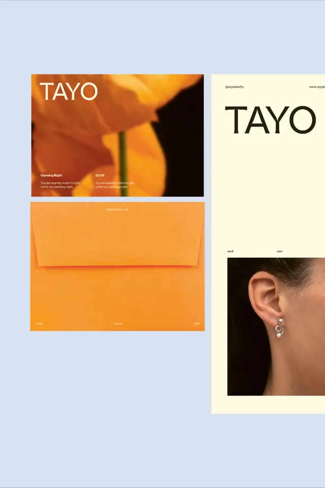
A jewelry-brand identity board pairing a tall serif 'TAYO' wordmark with macro orange-poppy photography, a vivid orange envelope, and a clean product shot.
Summary
A multi-asset brand board for "TAYO", a jewelry label, set on a pale blue ground. It threads a single tall serif wordmark across a warm-orange invitation card, a saturated orange paper envelope, and a cream product poster of a silver earring.
Visual description
Three to four pieces float on a soft periwinkle backdrop. Top-left is an opening-night invite: a macro shot of a glowing orange poppy with "TAYO" set large in white serif and small two-column body copy at the bottom. Below it sits a flat-lay of a bright orange A-line envelope, its url printed tiny on the flap and the words "body / nature / skin" running along the base. The right column is a tall cream poster carrying a heavy black "TAYO" up top, social and web handles in the corners, and a cropped photograph of an ear wearing a fluid silver-and-pearl earring, captioned "neck" and "ears". Type is consistently a high-contrast serif; the orange-on-cream palette is the through-line.
Key takeaway
Running one identical wordmark across radically different surfaces (dark photo, flat orange paper, pale poster) to prove a system holds together. Also the tiny functional labels ("neck", "ears", "body / nature / skin") used as quiet captions that add an editorial, catalogue-like rhythm without shouting.
Reuse notes
A good template for a small fashion, jewelry, or beauty launch that needs an invite, packaging, and a lookbook page to read as one family. The warm-orange-plus-cream-plus-periwinkle combination is the signature. Caveat: it leans on genuinely good macro and product photography to carry the warmth, so the imagery budget matters.
More like this

Keep what you find
A free account saves references to boards and can send you a weekly email of picks based on what you save.
To see every result, go Pro.