Preview image. Unlock full-res
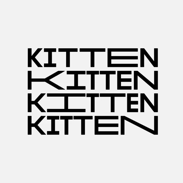
Bold, repeating typographic wordmark identity for Kitten, a Berlin restaurant combining deli, bakery, and café, featuring a flexible geometric sans-serif system.

Summary
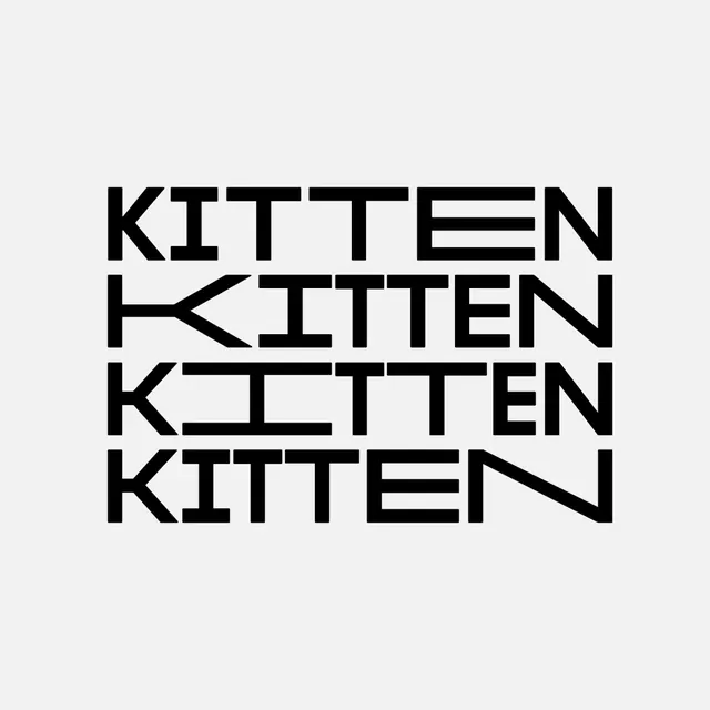
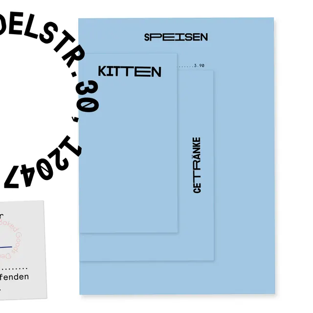
A bold typographic identity system for Kitten, a Berlin restaurant blending deli, bakery, and café concepts. The design uses a geometric, modular sans-serif that repeats the wordmark with slight variations, creating rhythm and visual interest while maintaining strong legibility.
Visual description
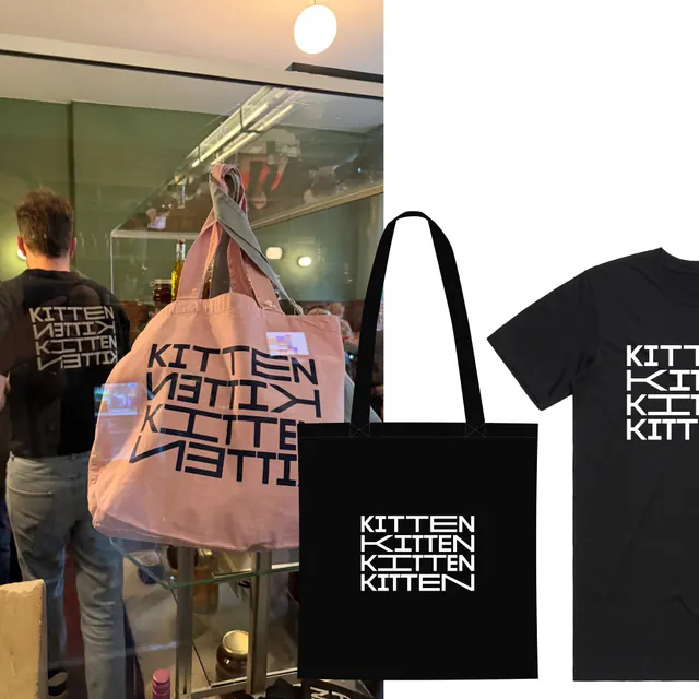
The word "KITTEN" is repeated four times in stacked rows, each iteration in a clean, geometric sans-serif typeface with uniform letterforms and subtle geometric breaks or openings in some characters. The text is rendered in black on a white background. The repetition creates a grid-like rhythm that emphasizes the breadth and flexibility of the typographic system. Each line maintains perfect alignment and spacing, suggesting this wordmark can scale, rotate, or be arranged in different configurations while remaining recognizable.
Key takeaway
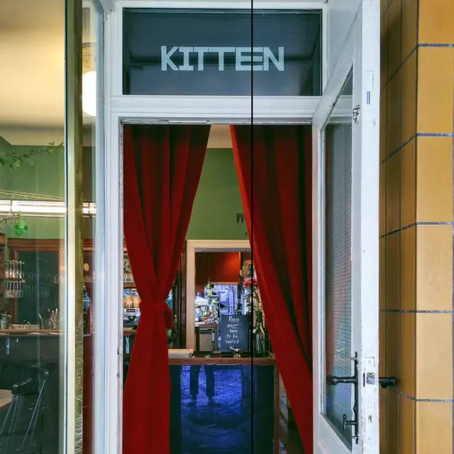
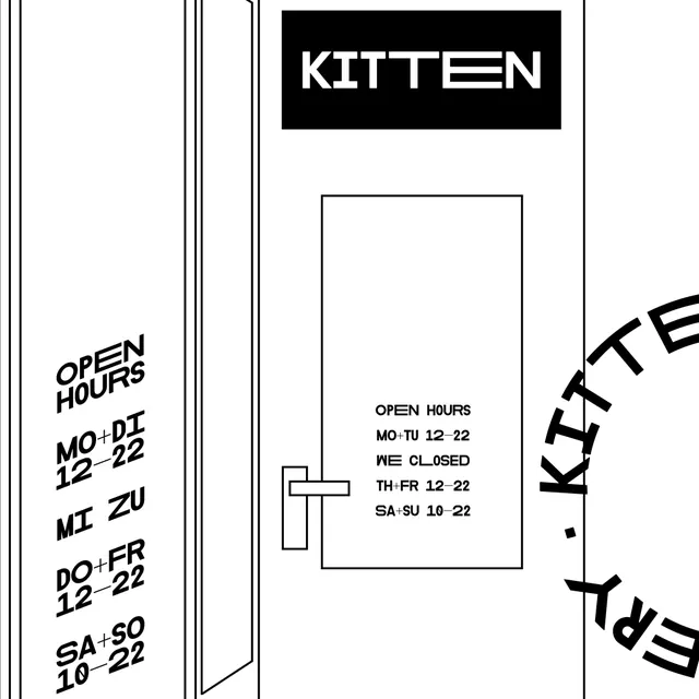
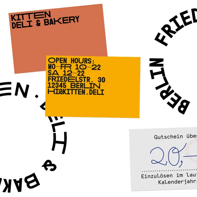
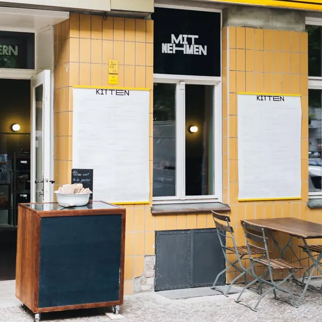
Using typographic repetition as a branding strategy rather than a single static mark. The geometric, open letterforms work across all applications (signage, menu, packaging). The modular system allows flexibility without losing brand recognition. Minimal and bold enough to function at any scale.
Reuse notes
Strong approach for food and hospitality brands that want personality without illustration. Works particularly well for brands spanning multiple concepts or functions. The bold, all-caps aesthetic suits contemporary European design. Best when applied consistently across all touchpoints to build pattern recognition.