Preview image. Unlock full-res
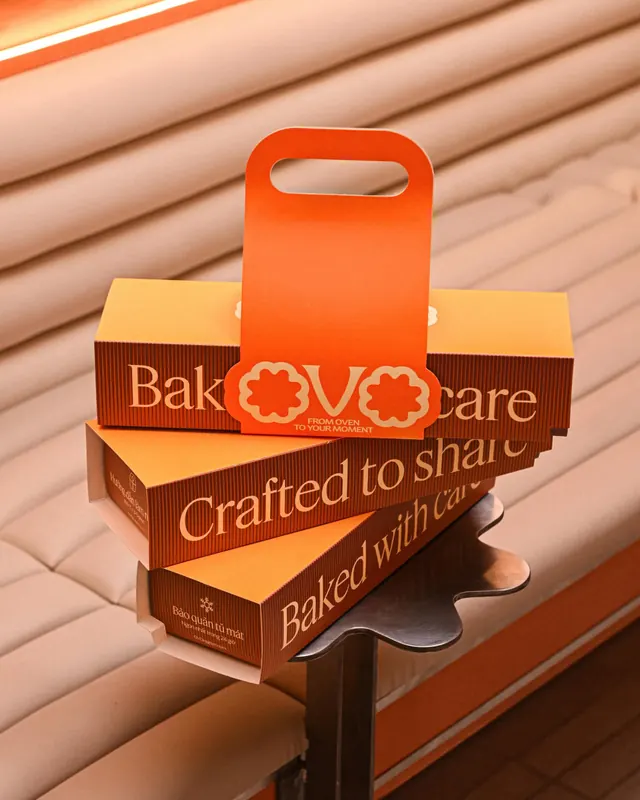
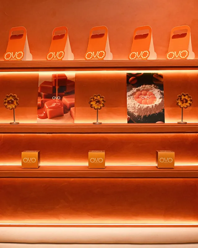
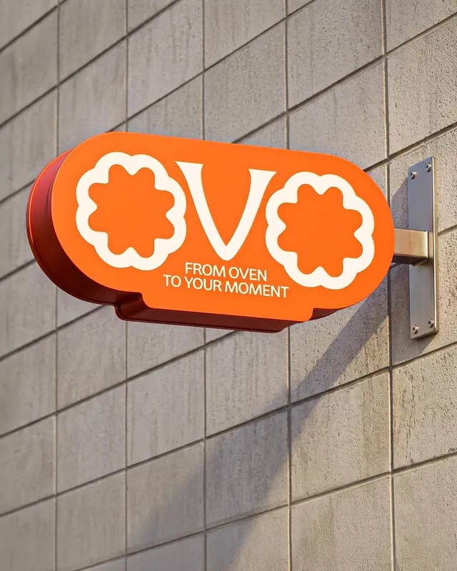
Ten-slide brand identity presentation for OVO, an egg tart brand, showing warm-toned packaging design, logo system, and product photography.
Summary
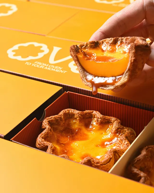
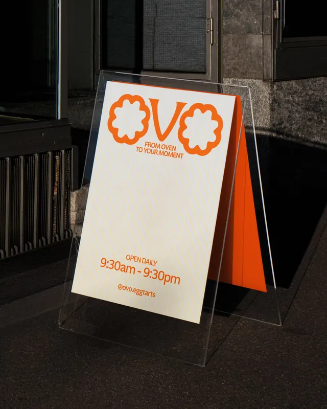
A comprehensive brand identity system for OVO, an egg tart company, displaying warm peachy-orange packaging, handmade product photography, playful logo mark with floral details, and layered box system showcasing craft and vibrancy.
Visual description
Ten slides present a cohesive warm color palette of oranges, golds, and creams. Stacked kraft paper boxes with bright orange handles and handles form the visual anchor. A playful flower-shaped logo in orange and cream repeats across surfaces. Packaging features serif and sans-serif typography balanced for elegance and accessibility. Some slides show packaged product stacked against soft wood textures and warm lighting. Display cases and in-store signage are photographed with soft daylight to emphasize the warm aesthetic.
Key takeaway
The flower logo and warm orange palette become a unified voice across all touchpoints. Three-dimensional product photography against natural backgrounds grounds an otherwise playful brand in craftsmanship and care. The layered, stackable box design tells a story of shared, artisanal goods.
Reuse notes
Excellent reference for food/bakery branding with a premium artisanal angle. The warm color gamut and floral motifs work well for female-focused or joy-centered consumer brands. Packaging structure with layered, nested forms suits gifting narratives. Videos show product stacking sequences and in-store setups.
From this post: OVO egg tart brand identity and packaging
View post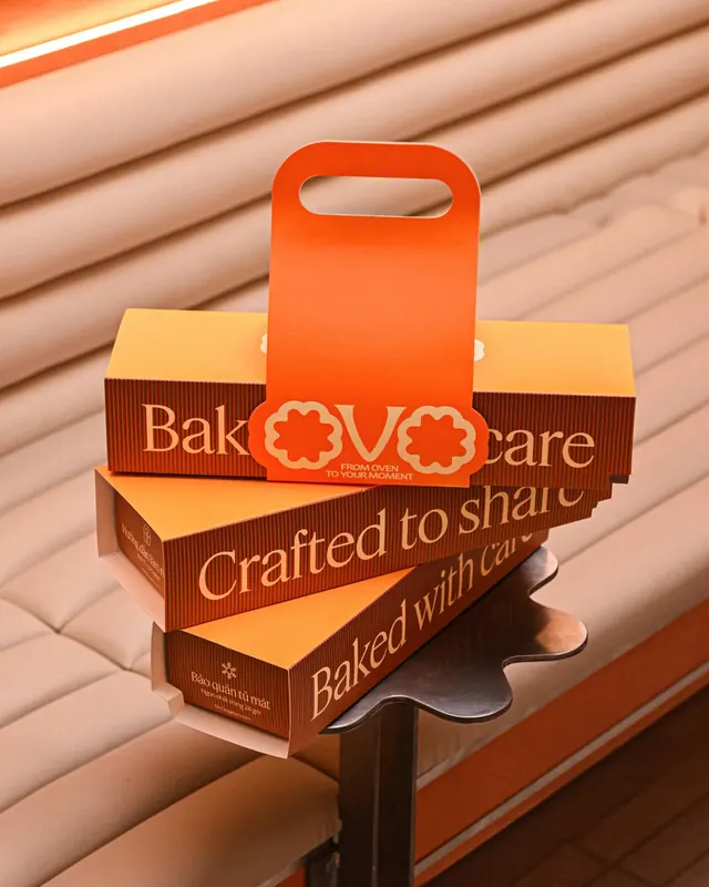

More like this
Keep what you find
A free account saves references to boards and can send you a weekly email of picks based on what you save.
To see every result, go Pro.