Preview image. Unlock full-res
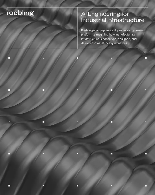
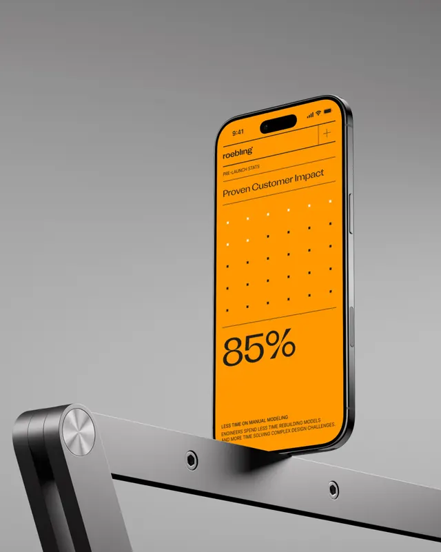
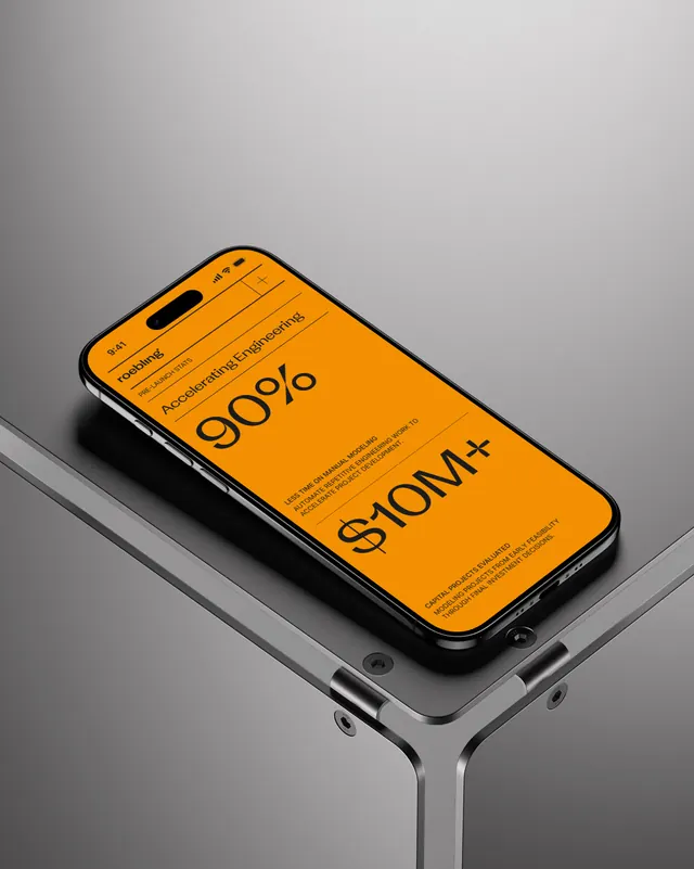
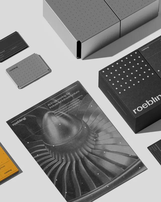
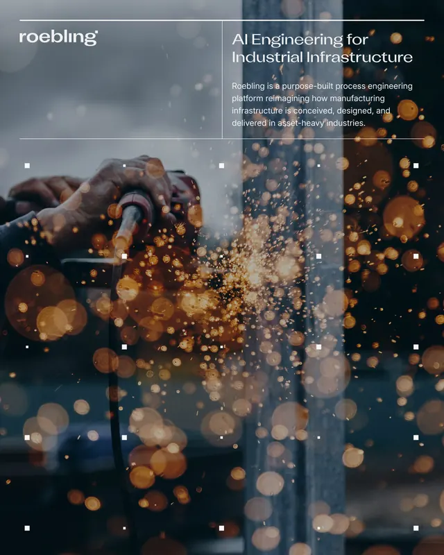
Technical B2B SaaS identity for an AI-powered industrial engineering platform, built from a single dot motif that evolves into dashboard grids, connection networks, and interface systems.

Summary
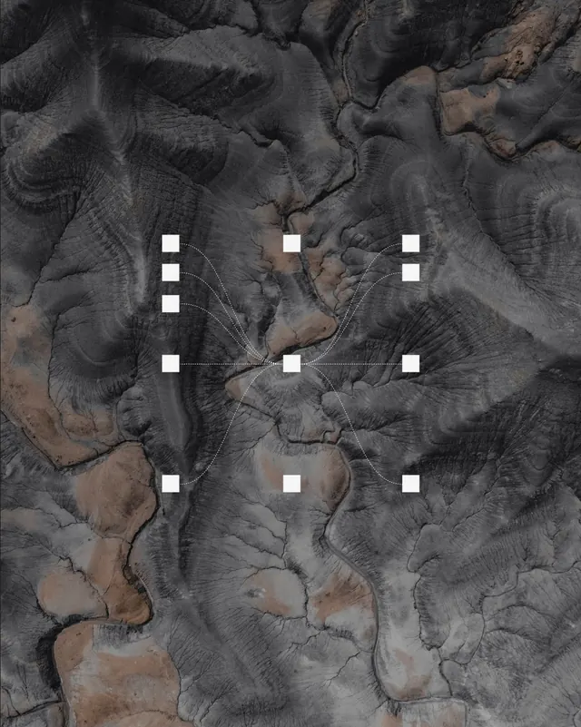
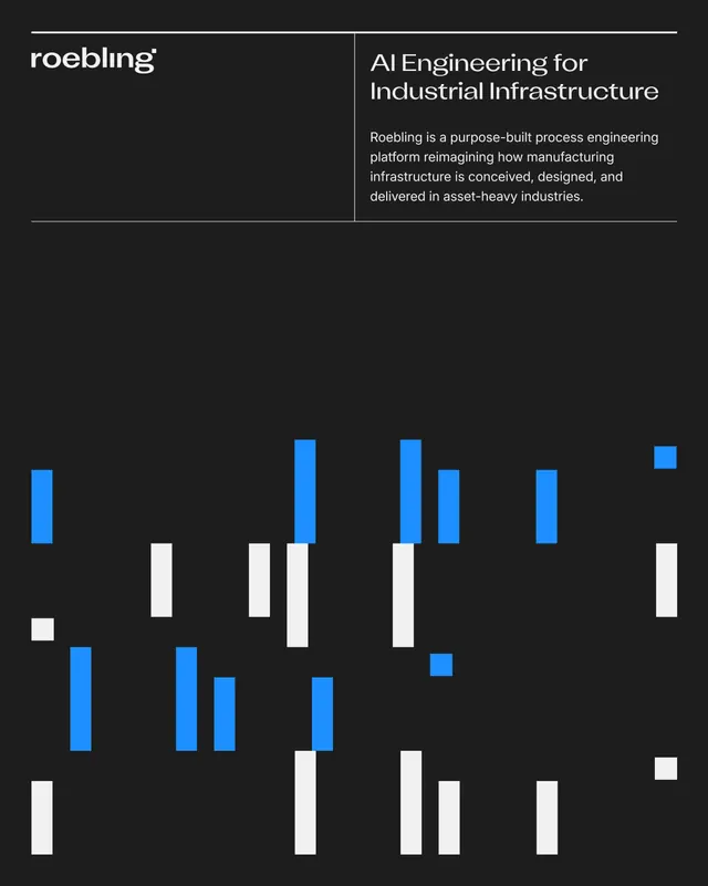
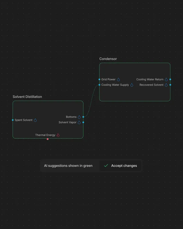
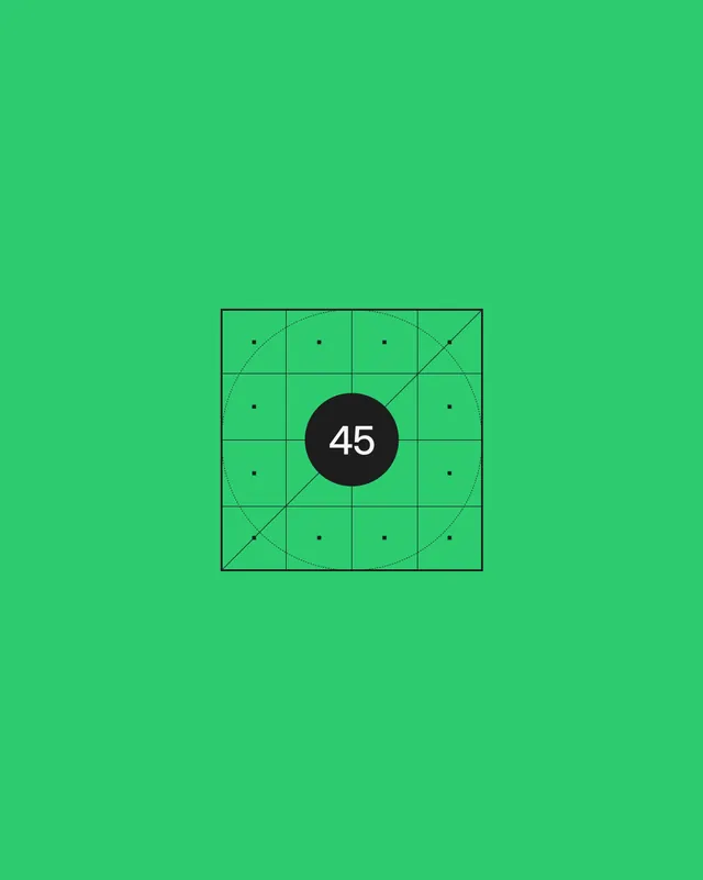
A rigorously constructed SaaS brand where every visual element stems from a single dot borrowed from the wordmark's i. That dot becomes a system node, expanding into dashboard grids, connection networks, and process-flow diagrams that directly mirror the product's engineering visualization language.
Visual description
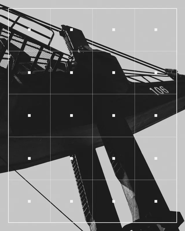
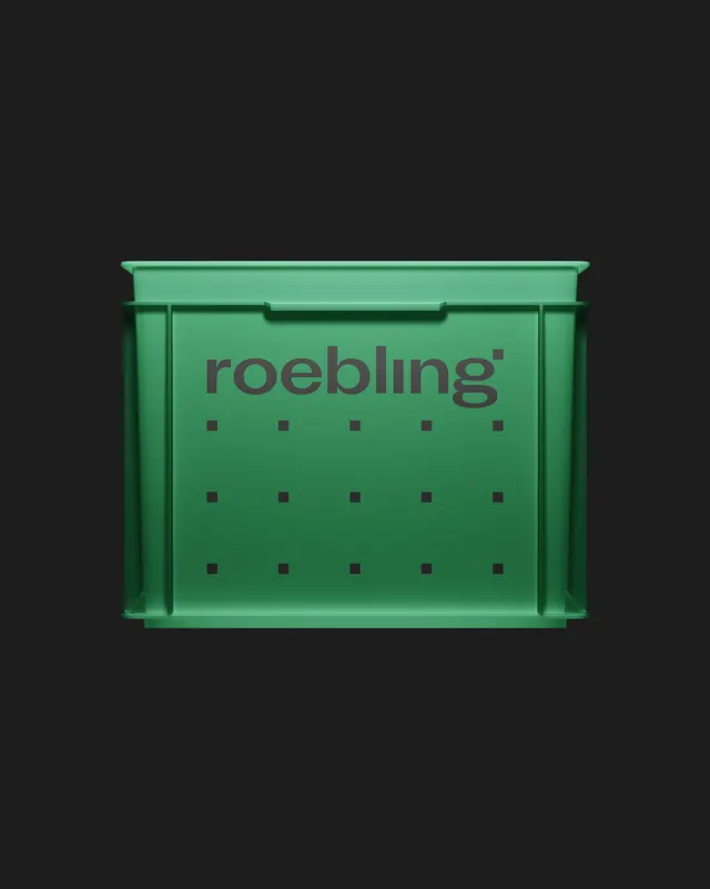
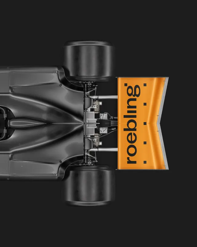
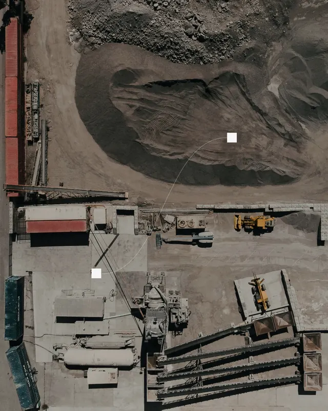
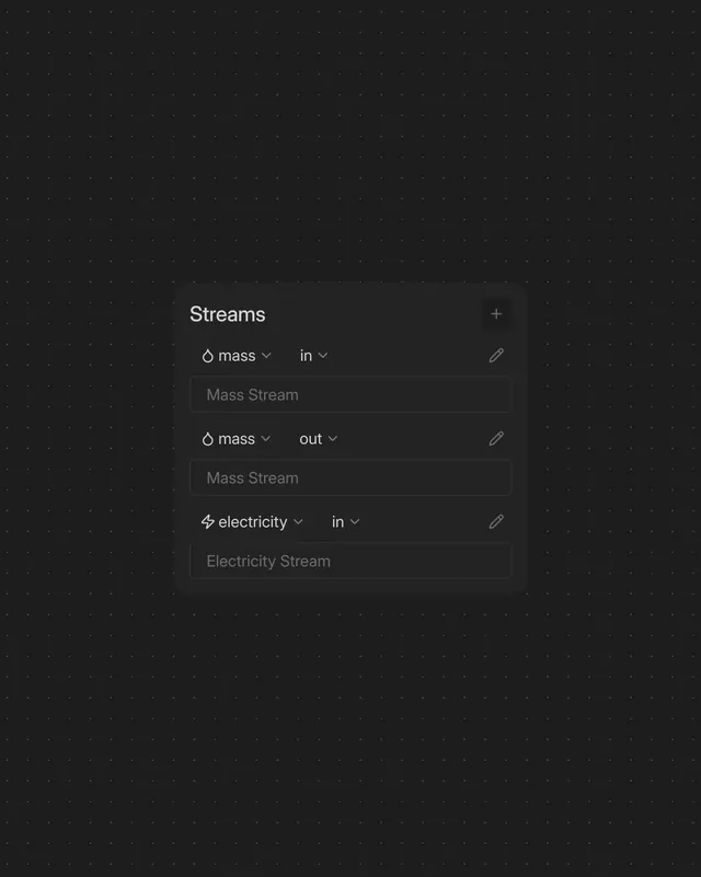
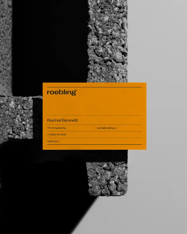
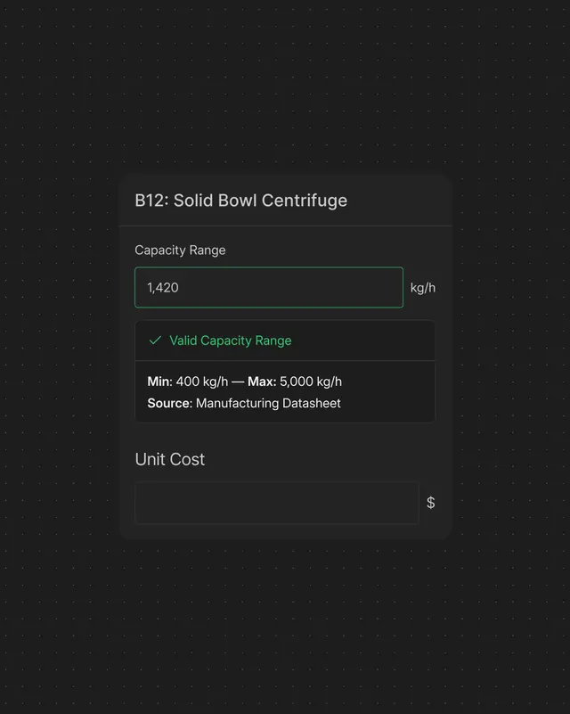
Bright blue background (#004EFF) serves as the primary color field. Bold black sans-serif wordmark "roebling" rendered in heavy, geometric letterforms with small black squares distributed rhythmically around the text - each square represents a nodal point in the system. Slides showcase this dot-as-node concept applied across: diagrammatic process flows with connected nodes and curved connection lines overlaid on industrial photography (refineries, infrastructure), product interface mockups showing dashboard grids and control systems, business cards, apparel, vehicle graphics, and technical documentation. White and black dominate; accent colors emerge in red engineering diagram elements and data-visualization graphics. Typography remains consistent and condensed.
Key takeaway
The brilliance of deriving the entire system from a single, functional element (the dot from the i) rather than creating a decorative system. The constraint forces coherence - every design decision traces back to node-and-connection logic. The bright blue and high-contrast black read as both modern tech and industrial/engineering. The system scales from micro (business card dot) to macro (building-size infrastructure mockups) without losing recognition.
Reuse notes
Outstanding model for B2B tech brands that want to communicate precision and systems thinking. The dot-as-network motif is particularly strong for platforms involving data modeling, connections, workflows, or spatial systems. The restricted color palette (blue, black, white) works internationally without cultural collisions. Video content in the carousel (seen in slide 1 poster) is essential to demonstrate motion and connection in the system. The approach requires a product or service with inherently visual/diagrammatic components; less effective for purely service-based offers.
From this post: Roebling AI engineering platform branding
View post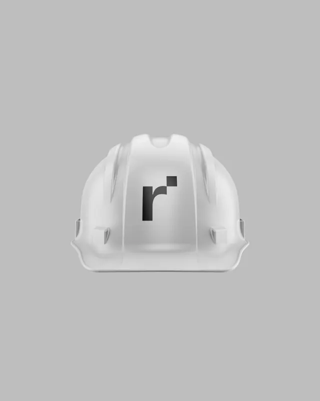

More like this

Keep what you find
A free account saves references to boards and can send you a weekly email of picks based on what you save.
To see every result, go Pro.