
Preview image. Unlock full-res
A 10-slide visual identity system for Hilal Spatial Studio (interior design focused on spatial experience), featuring a geometric cross mark, technical documentation, brand guidelines, and application mockups in a minimal grayscale palette.
Summary
A minimalist visual identity system for Hilal Spatial Studio (HSS), an interior design consultancy, built around a geometric cross/plus mark in grayscale, supported by technical brand documentation, spatial principle diagrams, and application examples.
Visual description
Slide 1: The primary mark-a white geometric cross (plus sign) composed of intersecting bars-presented centered on a solid medium-gray ground. Clean, symmetrical, highly recognizable.
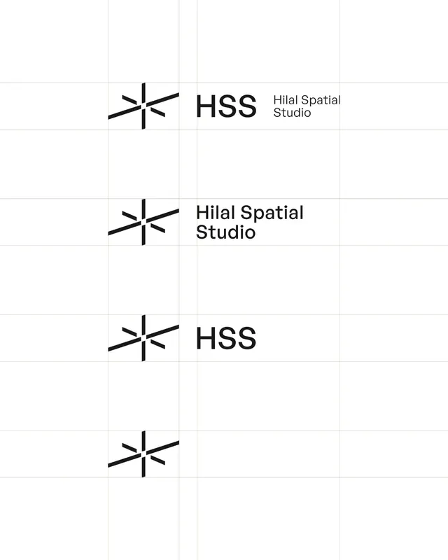
Slide 3: Technical documentation showing the mark in a blueprint-style grid with construction geometry and measurements visible.
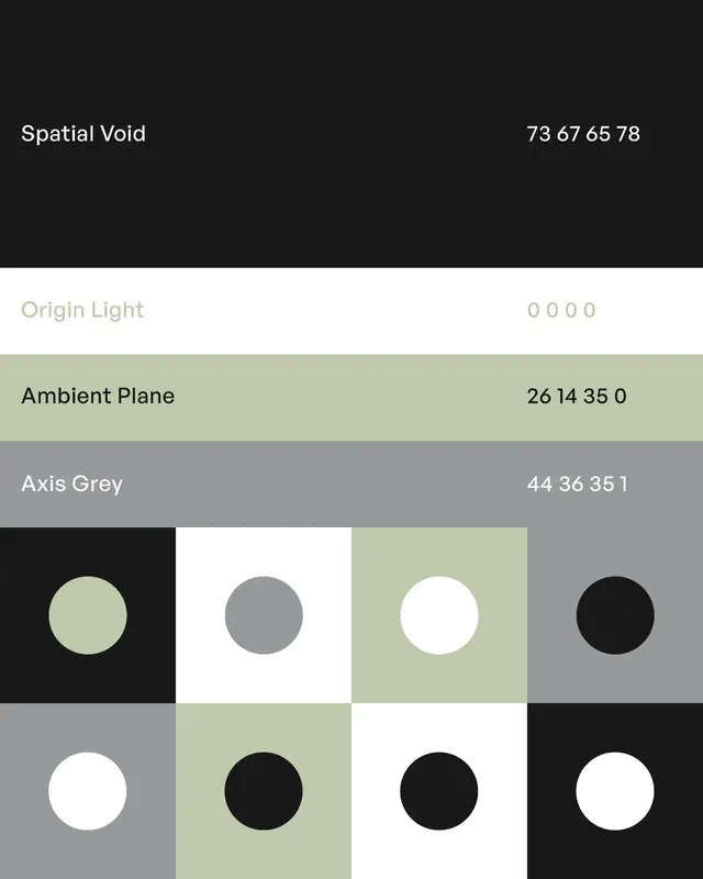
Slide 4: Brand manual spread showing the mark paired with accompanying typography (HSS wordmark, geometric sans-serif), color palette (grayscale), and spatial philosophy statement.
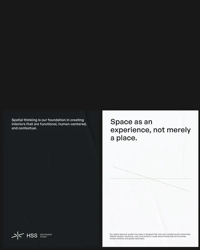
Slide 5: Poster design illustrating the brand concept with the mark and spatial/dimensional language.
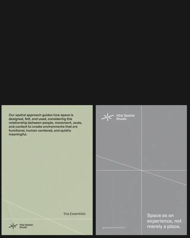
Slide 6: Comprehensive brand guideline spread with philosophy statement: "spatial approach guides how space is designed, felt, used, considering the relationship between people, movement, scale, and context." Hand-drawn spatial diagrams complement the type.
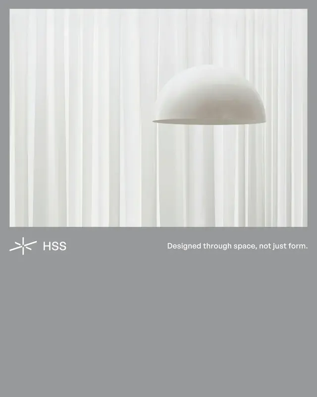
Slides 7–10: Application examples-interior photography showing the mark/identity subtly integrated into spatial design (lighting, material, layout); business card and stationery mockups; the system applied consistently across touchpoints.
Key takeaway
A geometric mark system that directly reflects the brand's core message: the cross/plus references spatial intersection, axes, and coordinate systems. The minimal grayscale palette ensures the identity does not compete with the interior spaces themselves. Technical documentation (blueprints, grids) reinforces the architectural/precision nature of the work.
Reuse notes
Ideal for architecture, interior design, and spatial consultancy branding. The plus-mark is simple but distinctive and scales well (signage, digital, print). Grayscale identities work best when the brand's actual work (built spaces, photography) is rich and colorful-the identity steps back. The hand-drawn diagrams and spatial philosophy text elevate the system beyond sterile minimalism.
From this post: Hilal Spatial Studio visual identity system
View post
More like this



Keep what you find
A free account saves references to boards and can send you a weekly email of picks based on what you save.
To see every result, go Pro.