Preview image. Unlock full-res
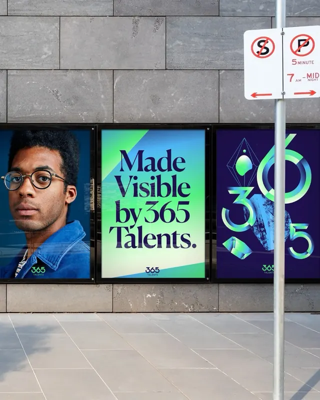
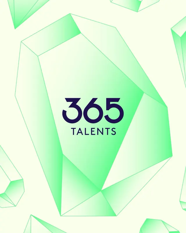
Bold rebrand for talent platform 365Talents featuring neon geometric type, high-contrast color system, and integrated application across collateral, packaging, signage, and digital.

Summary
A vibrant rebrand for 365Talents showcasing a bold geometric display typeface in neon green and cyan against navy, applied across packaging, outdoor signage, web interfaces, and brand collateral.
Visual description
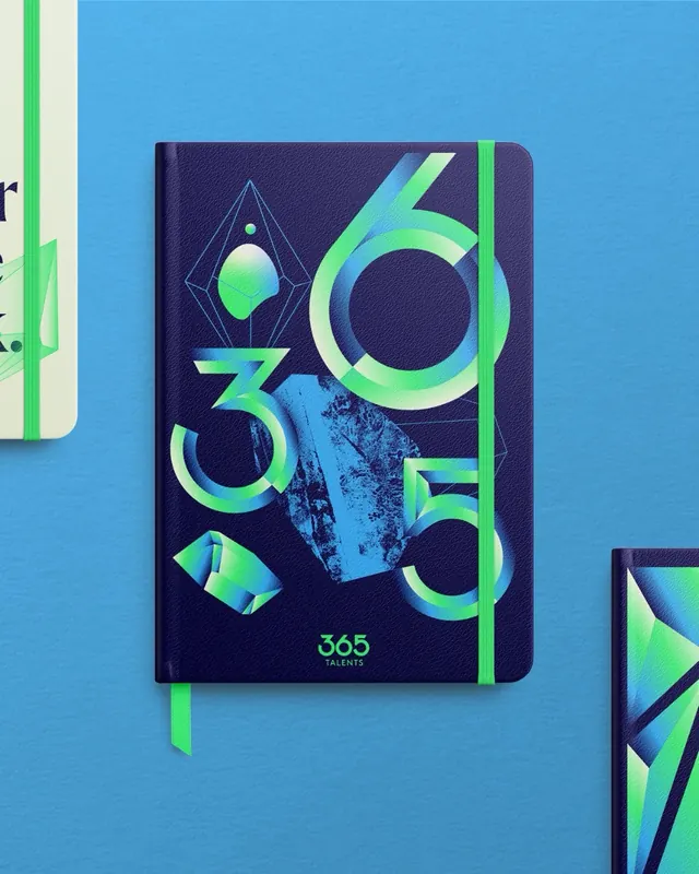
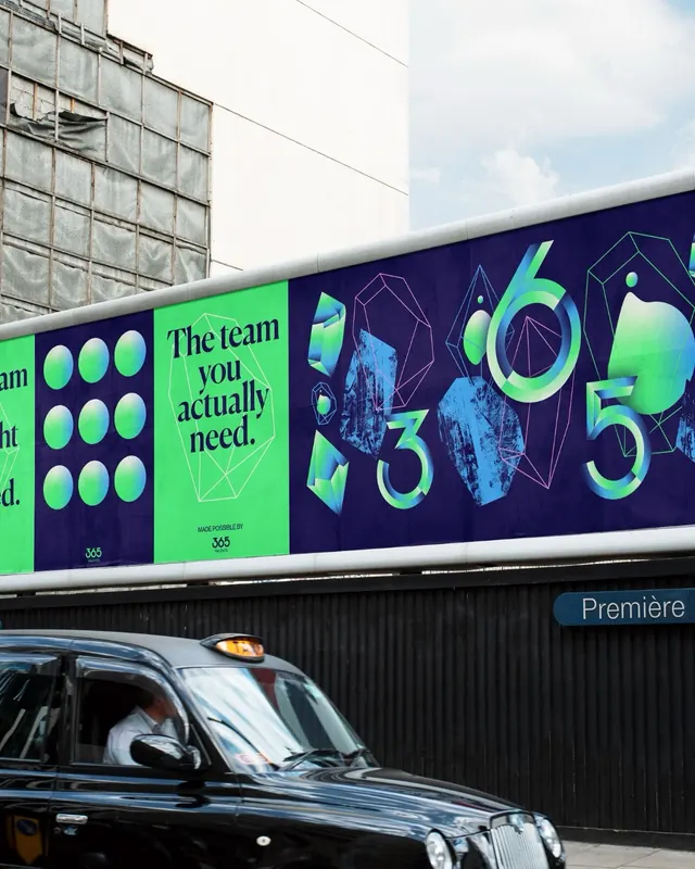
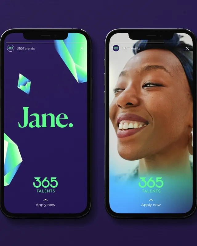
Five slides presenting the rebrand strategy. Slide 1 (cover) shows a branded notebook with bold neon geometric type forming "365 TALENTS" on a deep navy background with neon accents. Slide 2 is a billboard application with the same high-contrast palette and geometric letterforms, demonstrating outdoor scale. Slides 3-4 show digital applications including mobile interface screens and web layouts. Slide 5 presents additional collateral and packaging. The color system is consistently navy with bright neon green and cyan used for hierarchy and emphasis. Typography is custom geometric, emphasizing angular forms and strong visual presence.
Key takeaway
How a custom geometric typeface can anchor an entire brand system and work at multiple scales from intimate packaging to billboard signage. The neon color choice creates instant recognition and modern energy. The constraint of two primary colors with one dark background creates powerful visual cohesion.
Reuse notes
Strong for tech, saas, or marketplace brands targeting young audiences or wanting to signal innovation. The geometric type works well when the brand needs visual distinction and boldness. Neon accents can feel trendy, so pair with refined applications to avoid appearing dated. The high-contrast approach works at scale and in small sizes.
From this post: 365Talents brand identity redesign
View post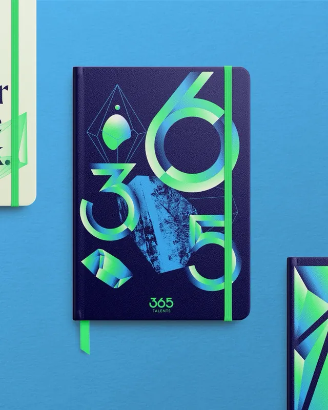
More like this
Keep what you find
A free account saves references to boards and can send you a weekly email of picks based on what you save.
To see every result, go Pro.